Developer Guide — wafermap¶
For: developers integrating the library. Read first: Quick Start. If you're an engineer using an app built with wafermap, you want the Application User Guide instead.
This guide walks through building wafer map visualisations in a real application, from a single interactive map up to a multi-wafer gallery with statistical findings. It focuses on practical patterns; for the full type reference see API Reference. For a visual overview of how the library fits together, see Architecture.
How to read this guide. The first six sections — Installation and setup through Working with test values — are the core path: read them in order to go from install to a map coloured by bins or test values. Everything after that is a topic jump: pick the section for the feature you need (findings, gallery, Insights, worker, …). Each feature section ends with a → Demo link to a live example page showing the same feature as working code.
Architecture at a glance¶
If you are trying to understand the shape of the library before choosing an API, start with Architecture. It shows the top-level flow from raw wafer data to built maps, rendered views, analysis summaries, and worker-based execution.
Installation and setup¶
Install the package:
The preferred canvas renderers have no external dependencies.
With a bundler (Vite, webpack, etc.)¶
import { buildWaferMap } from '@wafertools/wafermap';
import { renderWaferMap } from '@wafertools/wafermap/render';
import { analyzeWaferMap } from '@wafertools/wafermap/stats';
Plain HTML (CDN / script tags)¶
<script type="module">
  import { buildWaferMap } from 'https://esm.sh/@wafertools/wafermap';
  import { renderWaferMap, renderWaferGallery } from 'https://esm.sh/@wafertools/wafermap/render';
</script>
Your first wafer map¶
The minimal path is two function calls: buildWaferMap to process your data, then
renderWaferMap to draw it.
renderWaferMap creates and manages its own <canvas> — pass any block element
sized to the desired display area:
<!-- Fixed size: -->
<div id="map" style="width:500px; height:500px;"></div>

<!-- Responsive square (fills its container, always square): -->
<div id="map" style="width:100%; aspect-ratio:1;"></div>
import { buildWaferMap } from '@wafertools/wafermap';
import { renderWaferMap } from '@wafertools/wafermap/render';

// Minimum input: x/y die grid positions. The library infers everything else.
const result = buildWaferMap([
  { x:  0, y:  0, hbin: 1 },
  { x:  1, y:  0, hbin: 2 },
  { x:  0, y: -1, hbin: 1 },
  { x:  1, y: -1, hbin: 1 },
  // ... more dies
]);

renderWaferMap(document.getElementById('map'), result);
To respond to die clicks, pass an onClick callback — the Die object has x, y, hbin, sbin, and testValues:
renderWaferMap(document.getElementById('map'), result, {
  onClick: (die) => console.log(die.x, die.y, die.hbin),
});
renderWaferMap returns immediately and mounts a self-contained interactive map.
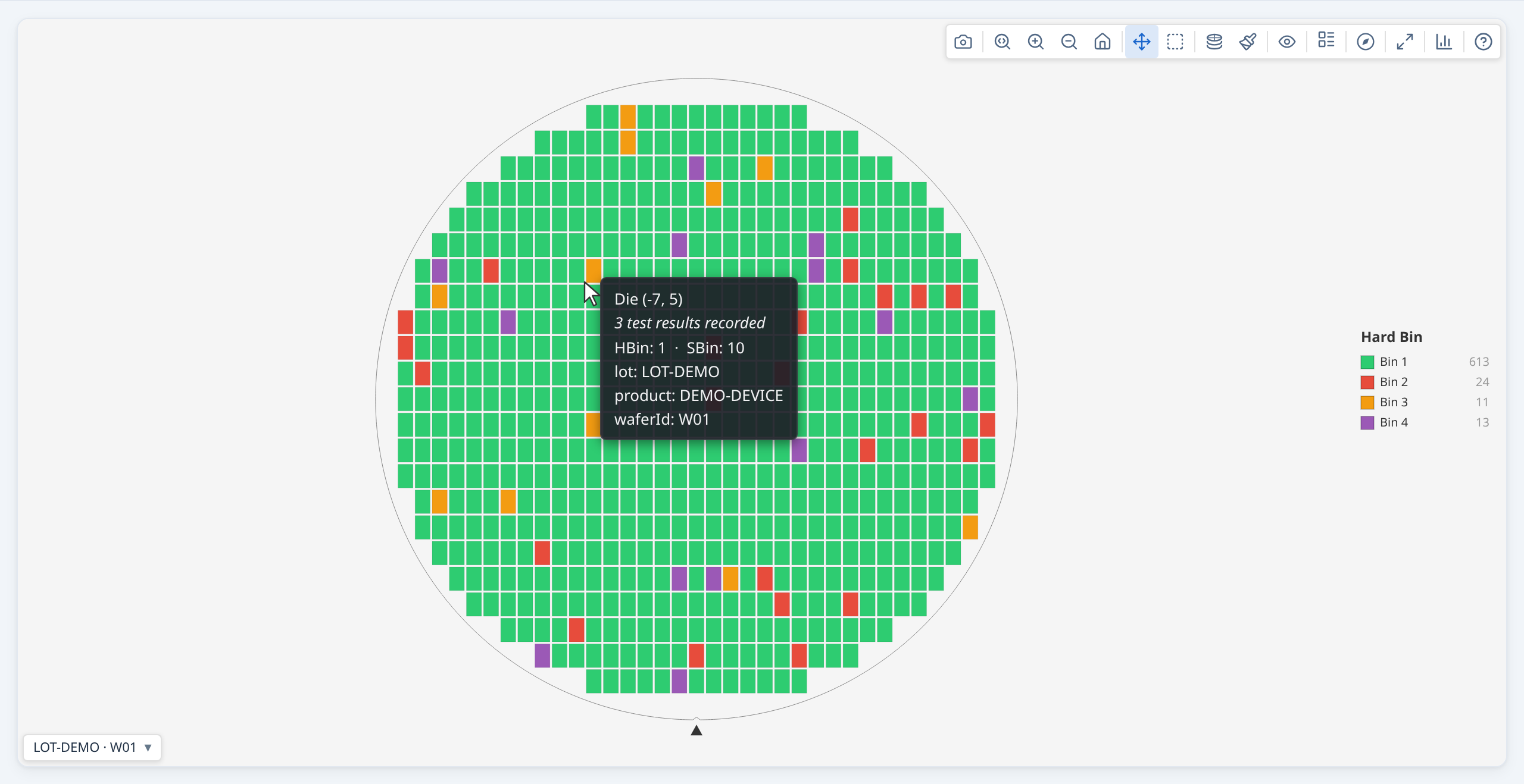
A toolbar is always shown (top-right), giving users access to all display controls — no extra
HTML or JavaScript required (showToolbar defaults to true). The toolbar includes an expand button (⛶) that
opens the map in an enlarged modal overlay without rebuilding the view.
xandyare always die grid positions (prober step coordinates) — integers like −7, 0, 5. They are NOT millimetre values. The library converts to physical mm internally when you supply a die size.
Loading real data from a CSV¶
In practice your data comes from a wafer prober log, STDF export, or a CSV pulled from your database. A typical row has a wafer ID, die grid position, and one or more test results.
lot,wafer,x,y,hbin,sbin,testA,testB,testC
LOT123,W01,-7,-2,3,45,1.098,0.773,5.758
LOT123,W01,-7,-1,1,10,1.099,0.772,5.966
...
Parse the CSV and map each row to a DieResult. All numeric fields must be cast to number — CSV parsers return strings. buildWaferMap will throw a descriptive error if it detects string x/y coordinates, but other fields such as hbin and testValues values must also be cast to avoid silent NaN artefacts.
import { buildWaferMap } from '@wafertools/wafermap';
import { renderWaferMap } from '@wafertools/wafermap/render';

async function loadAndRender(csvText: string, container: HTMLElement) {
  const rows = parseCsv(csvText);  // your CSV parser of choice

  const results = rows.map(r => ({
    x:          Number(r.x),       // must be number — not string "3"
    y:          Number(r.y),
    hbin:       Number(r.hbin),
    sbin:       Number(r.sbin),
    testValues: { 1010: Number(r.testA), 1020: Number(r.testB), 1030: Number(r.testC) },
  }));

  const result = buildWaferMap({
    results,
    testDefs: [
      { testNumber: 1010, name: 'TestA' },
      { testNumber: 1020, name: 'TestB' },
      { testNumber: 1030, name: 'TestC' },
    ],
  });
  renderWaferMap(container, result);
}
x and y are the prober step positions from your equipment — pass them directly,
no unit conversion needed.
→ Demo: Loading real data from a CSV
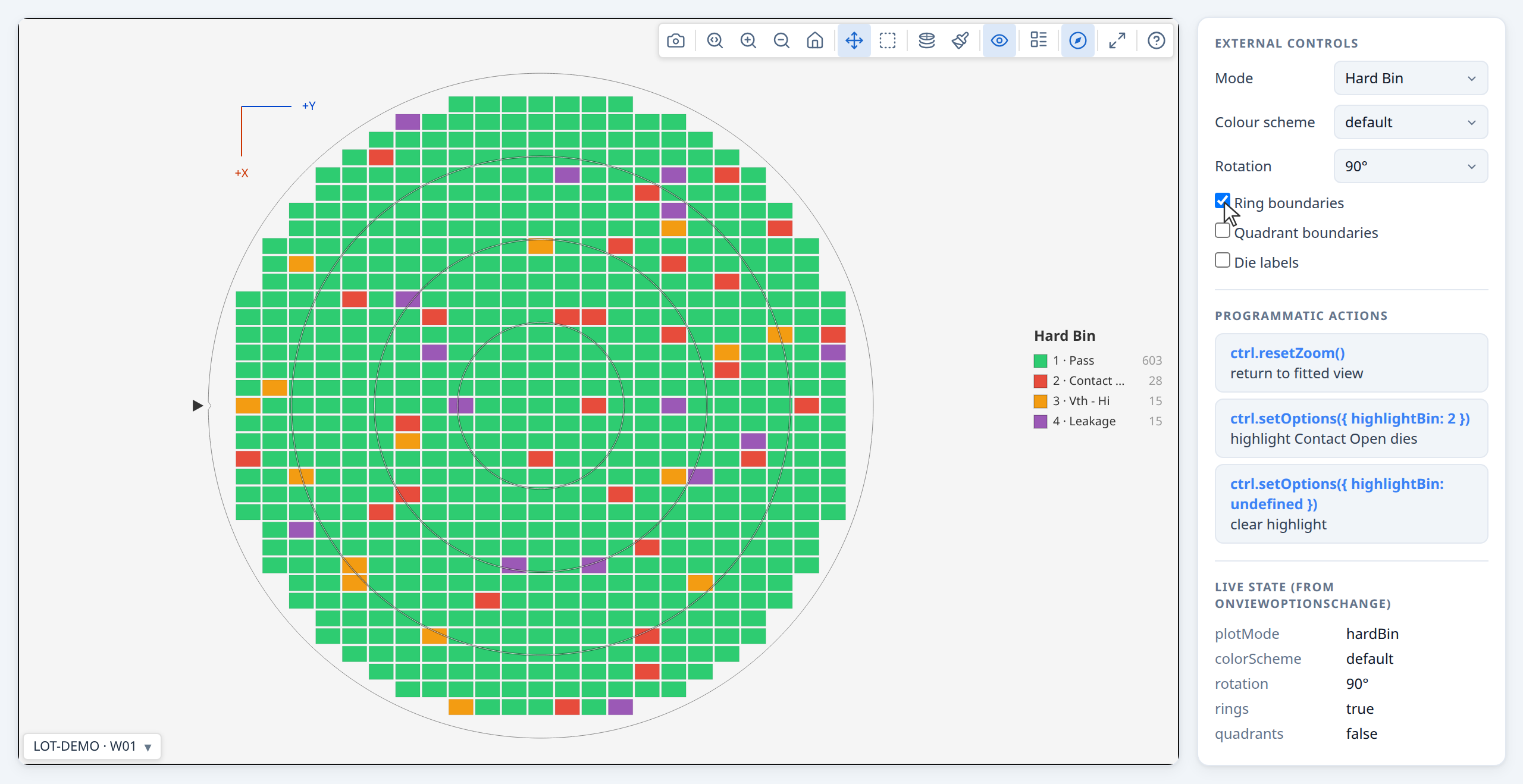
Here we have toggled some toolbar options on: XY Axis indicator and Ring boundaries.
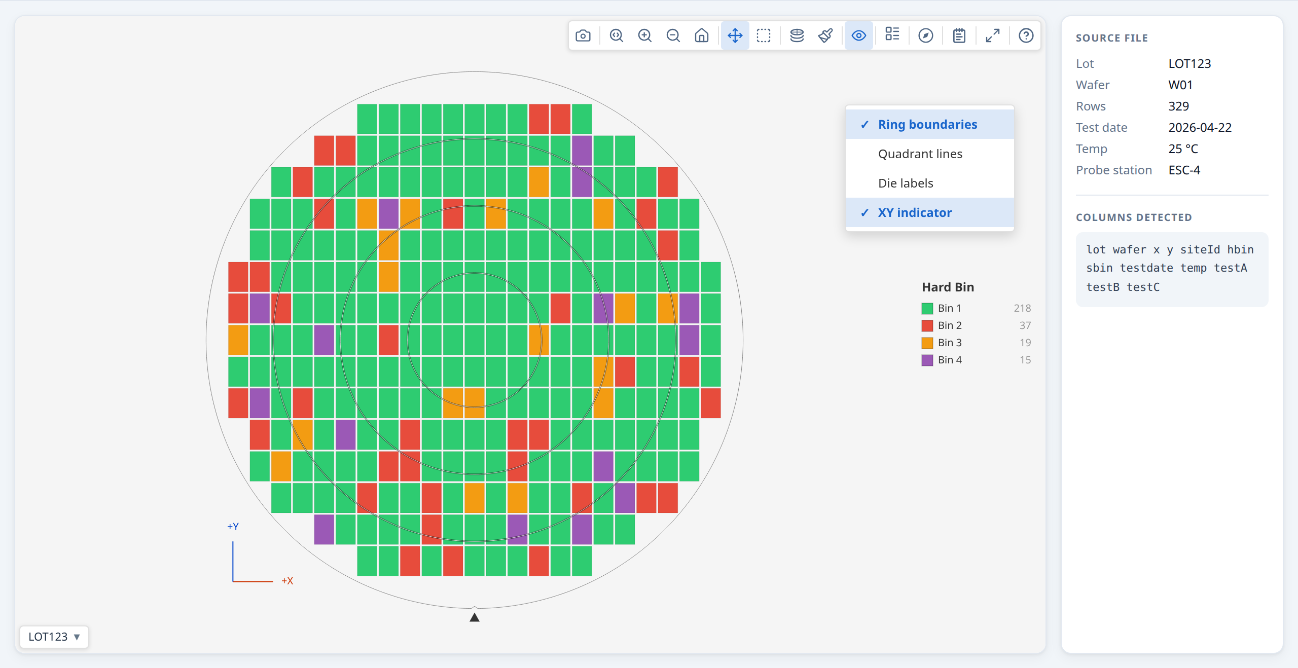
For a real-world dataset, see Demo: Real wafer defect data (WM-811K), which loads a sample from the WM-811K public dataset and lets you explore the spatial findings engine across known defect pattern types (Center, Donut, Edge-Loc, Scratch, etc.).
Adding die size and wafer geometry¶
When you supply physical dimensions, die.physX and die.physY are in millimetres and the wafer boundary is drawn to scale; die.x/die.y remain die grid positions (prober step coordinates).
const result = buildWaferMap({
  results,
  waferConfig: {
    diameter:  300,                       // mm — 200 or 300 are most common
    notch:     { type: 'bottom' },        // physical alignment notch direction
  },
  dieConfig: {
    width:  10,                           // mm — die X pitch
    height: 10,                           // mm — die Y pitch
  },
});
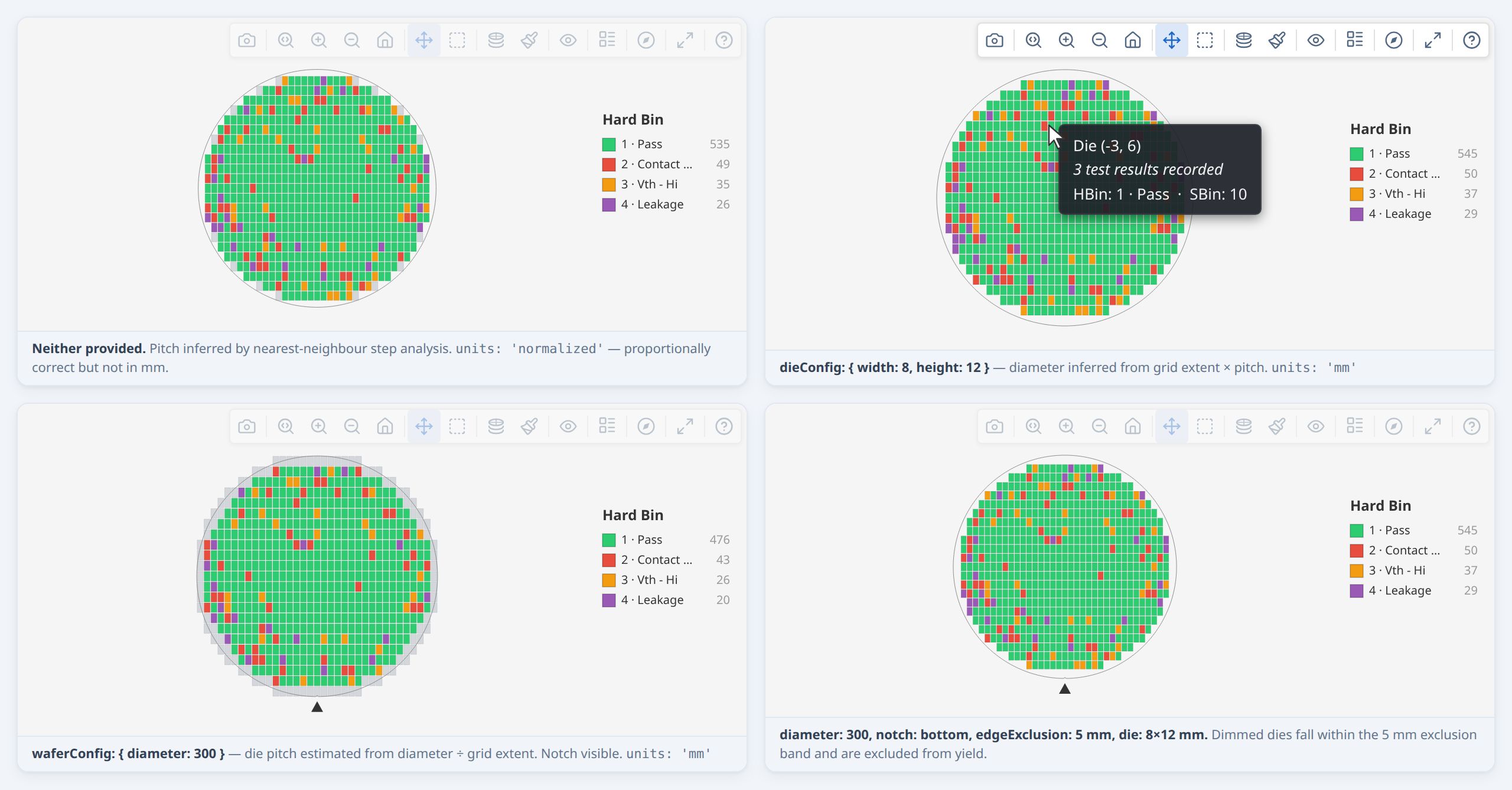
The notch renders as a V-notch on 200 mm+ wafers and as a flat on smaller wafers — you don't need to specify which.
When you don't know the geometry¶
Omit any field you don't know — the library infers what it can:
// Die size known, diameter unknown → diameter inferred from grid extent
buildWaferMap({ results, dieConfig: { width: 10, height: 10 } });

// Diameter known, die size unknown → die size estimated from diameter ÷ grid extent.
// Raises no advisory: the pitch is derived to fit the diameter you gave, so it is
// self-consistent by construction and there is nothing to check it against. It is
// still an assumption — it takes the grid as reaching the wafer edge — so prefer
// supplying `dieConfig.width`/`height` when you know them.
//
// The reverse case IS checkable, and does warn: supply a pitch without a diameter
// and the wafer is sized from the die extent, so a result off the standard ladder
// (100/150/200/300 mm) means the grid did not reach the edge — see
// `non-standard-diameter` in the warnings table.
buildWaferMap({ results, waferConfig: { diameter: 300 } });

// Nothing known → proportionally correct layout in normalised units
buildWaferMap({ results });
Check result.units to know which case applied: 'mm' means physical millimetres;
'normalized' means grid-relative units.
Partial data — anchoring the wafer centre¶
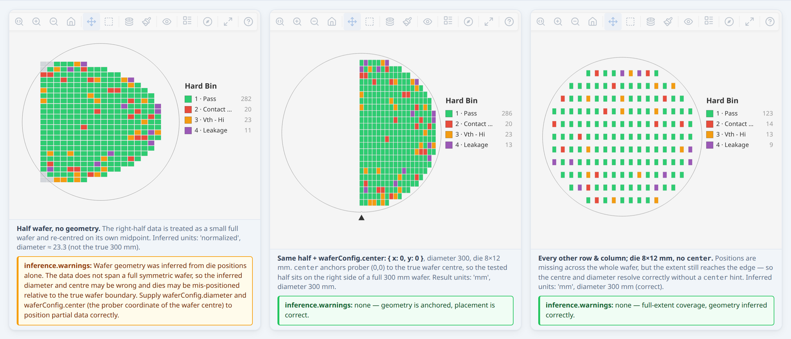
Inference reads geometry from how far your data reaches. That works as long as the data reaches the true wafer edge — including sparse data, where positions are missing across the whole face (systematic skip-sampling such as 1-in-4, or random sampling). Sparse data still resolves the diameter and centre correctly with no hints.
It breaks for partial data — a contiguous region that stops short of the edge: a half wafer, a single quadrant, a slice, or an off-centre cluster. The extent understates the wafer, so the region is mistaken for a smaller full wafer and re-centred on its own midpoint. For partial data, give the library the true diameter and the prober coordinate of the wafer centre:
// Only the right half of a 300 mm wafer was tested; prober (0,0) is the centre.
const result = buildWaferMap({
  results,
  waferConfig: { diameter: 300, center: { x: 0, y: 0 } },
  dieConfig:   { width: 10, height: 10 },
});
waferConfig.center anchors placement to the real centre. It does not change the
public die.x/die.y labels — those stay the original prober coordinates.
When the library detects likely-partial coverage with no center, it adds a
structured WaferWarning to result.warnings (code 'partial-coverage') and sets
result.inference.wafer.method to 'inferred-partial'. Detection is heuristic,
so for any partial dataset set waferConfig.center explicitly rather than relying
on the warning.
You do not have to display this yourself. renderWaferMap and renderWaferGallery
show a ⚠ indicator in the toolbar whenever the result carries advisories, so an
engineer looking at a map built on guessed geometry is told so on screen. Geometry
advisories are severity 'error' — they mean dies may be drawn in the wrong place,
not that a feature is missing. If your app already has its own notification system,
pass warnings: { display: false, onWarning } and render them yourself; the library
still does the collecting and de-duplicating. See API §5.10.
→ Demo: Warnings the library surfaces
Edge exclusion¶
const result = buildWaferMap({
  results,
  waferConfig: { diameter: 300, edgeExclusion: 3 },  // 3 mm exclusion band
  dieConfig:   { width: 10, height: 10 },
});

console.log(result.yield.yieldPercent);  // excludes edge dies from numerator and denominator
Dies within the exclusion band have die.edgeExcluded = true and are shown dimmed
on the map.
Coordinate origins¶
If your prober uses a non-centred origin, tell the library:
// All x,y ≥ 0 → auto-detected as lower-left origin (no explicit config needed)
buildWaferMap({ results, dieConfig: { width: 10, height: 10 } });

// Row-based prober: origin at upper-left, Y increases downward
buildWaferMap({
  results,
  dieConfig: { width: 10, height: 10, coordinateOrigin: { type: 'UL' } },
});
→ Demo: Die size and wafer geometry
Working with bins¶
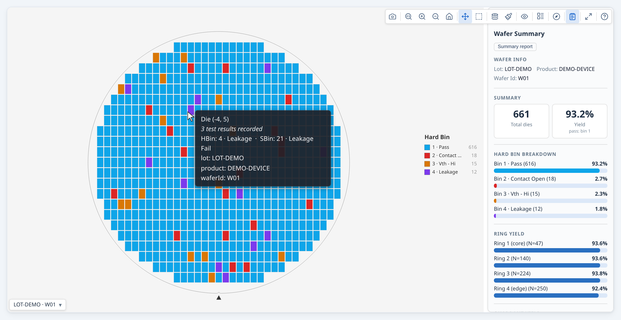
Bins are the primary pass/fail classification from wafer test equipment. Hard bins are the physical sort result; soft bins are the failure category assigned by the test program.
Basic bin map¶
const results = rows.map(r => ({
  x:    Number(r.x),
  y:    Number(r.y),
  hbin: Number(r.hbin),
}));

const result = buildWaferMap({ results });
renderWaferMap(container, result);
// Opens in 'hardBin' mode by default
Named bins with custom colours¶
Without names, bins are labelled "HBin 1", "HBin 2", etc. Supply hbinDefs for
readable labels and optional colour overrides:
const result = buildWaferMap({
  results,
  hbinDefs: [
    { bin: 1, name: 'Pass',          color: '#2ecc71' },
    { bin: 2, name: 'Contact Open',  color: '#e74c3c' },
    { bin: 3, name: 'Vth - Hi NMOS', color: '#e67e22' },
    { bin: 5, name: 'Continuity',    color: '#9b59b6' },
  ],
});

renderWaferMap(container, result, {
  viewOptions: { plotMode: 'hardBin' },
});
Tip: Pass
hbinDefsintobuildWaferMap, not justrenderWaferMap. The stats engine and tooltips both read them from the built result.
Hard bin and soft bin together¶
const results = rows.map(r => ({
  x:    Number(r.x),
  y:    Number(r.y),
  hbin: Number(r.hbin),
  sbin: Number(r.sbin),
}));

const result = buildWaferMap({
  results,
  hbinDefs: [ { bin: 1, name: 'Pass' }, /* ... */ ],
  sbinDefs: [ { bin: 10, name: 'Vth - Lo' }, { bin: 11, name: 'Vth - Hi' }, /* ... */ ],
});

renderWaferMap(container, result);
// hbinDefs and sbinDefs are inherited automatically from the result
// User can switch between Hard Bin and Soft Bin in the toolbar Mode menu
Pass bins and yield¶
The library counts yield against passBins (default [1]). Change this if your
pass bin isn't 1:
const result = buildWaferMap({
  results,
  passBins: [1, 100],   // bins 1 and 100 are both counted as pass
});

const yld = result.yield.yieldPercent;
console.log(yld !== null ? `${yld.toFixed(1)}%` : 'n/a');
Set pass bins once, here. The result carries them (result.passBins), and every
renderer, analysis, panel, report and chart reads them from it — so bin 100 above is green,
listed with the passing bins and counted as good everywhere, with nothing to repeat. In a
gallery each wafer keeps its own, so a lot mixing test programs is judged wafer by wafer. There is no
passBins option on the renderers or on analyzeWaferMap; a map you build yourself, without
buildWaferMap, states its own passBins on the map object.
Working with test values¶
Three related terms appear together throughout the API — here is how they fit:
| Term | Where it appears | Purpose |
|---|---|---|
testValues: { 1010: 0.95 } |
DieResult (input to buildWaferMap) |
Per-die measurement; key is the integer test number |
testDefs: [{ testNumber: 1010, name: 'Vth', unit: 'V' }] |
buildWaferMap options |
Connects test numbers to human-readable names and units; optional but recommended |
testNumbers: [1010, 1020] |
analyzeWaferMap options |
Filter — limits which tests the stats engine analyses; required only when the data has more tests than you want to analyse |
The integer key in testValues and testDef.testNumber must match exactly — the library uses these to link measurements to names and to drive the stats engine.
Continuous test measurements (leakage current, threshold voltage, etc.) go in
testValues — a map keyed by a stable integer test identity. TestDef is
optional: without it the library uses Test {N} (the testNumber) everywhere a
name would appear — mode dropdown, tooltip, colorbar axis, summary panel. Add
TestDef when you want human-readable names, units, and SI prefix formatting:
const results = rows.map(r => ({
  x:          Number(r.x),
  y:          Number(r.y),
  testValues: {
    1050: Number(r.idsat),
    1060: Number(r.vth),
    1070: Number(r.ioff),
  },
}));

const result = buildWaferMap({
  results,
  dieConfig: { width: 8, height: 12 },
  testDefs: [
    { testNumber: 1050, name: 'Idsat', unit: 'A' },
    { testNumber: 1060, name: 'Vth',   unit: 'V' },
    { testNumber: 1070, name: 'Ioff',  unit: 'A' },
  ],
});

renderWaferMap(container, result, {
  viewOptions: {
    plotMode:   'value',
    activeTest: 1050,   // testNumber for Idsat — NOT a positional index
    // testDefs inherited automatically from the result
  },
});
The testValues key is any stable integer that uniquely identifies the test — for
example an STDF TEST_NUM, a database test ID, or an application-defined constant.
The key must match the testNumber field in the corresponding TestDef.
Always pass the SI base unit in TestDef.unit (e.g. 'A', 'V', 'Ω', 'F').
The formatter applies SI prefixes automatically — 0.03 with unit 'Ω' displays as
30 mΩ. Passing a pre-scaled unit like 'mA' would produce incorrect labels
(e.g. 30 µmA instead of 30 nA).
With testDefs in place:
- The toolbar Mode dropdown shows one entry per test by name ("Idsat", "Vth", …) — without testDefs it shows "Test 1050", "Test 1060", etc.
- Hover tooltips show "Idsat: 1.23 mA" — without testDefs they show "Test 1050: 1.23 mA"
- The colorbar axis label includes the name and unit — without testDefs it shows "Test 1050"
- The summary panel Test Values section uses test names — without testDefs it uses "Test 1050", etc.
TestDef.logScale: true enables log₁₀ scale for that test by default (silently falls back to linear when any die value ≤ 0). The user can also toggle log scale at any time via the toolbar Log scale button, which overrides the per-test default.
Spec limits on test parameters¶
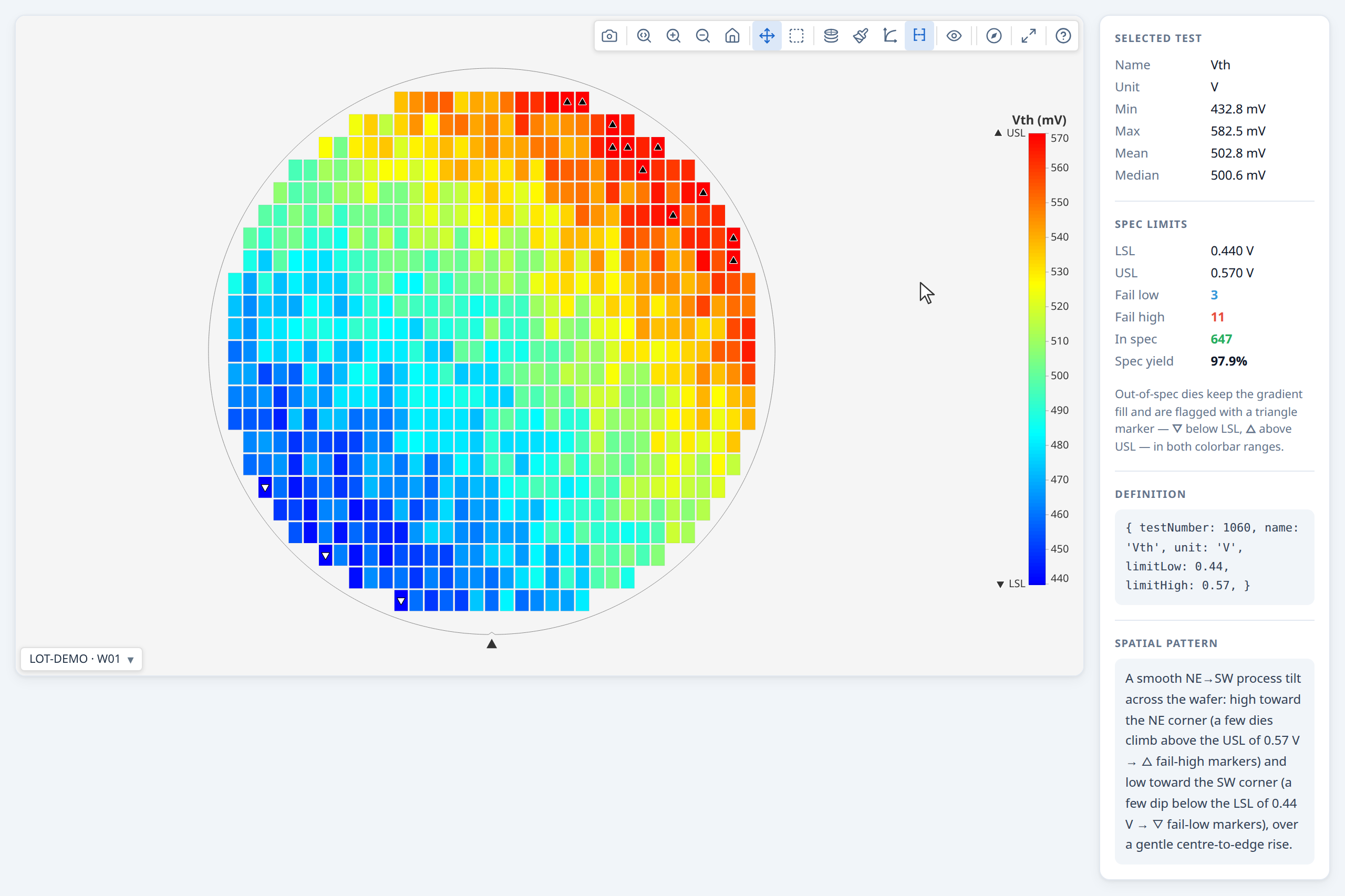
Add limitLow and/or limitHigh to a TestDef to specify the engineering specification window. Both are optional independently — one-sided limits are valid. Once limits are defined, two things happen automatically across all plot modes:
In value mode — spec limits affect both the colorbar and the die colours:
The colorbar always shows LSL / USL labels at the limit positions. Exactly how depends on the colorbar range mode (toggled via the bracket toolbar button):
colorbarRangeMode controls only the colorbar's numeric range — not how out-of-spec dies are shown:
colorbarRangeMode: 'spec'(default when limits are present) — the bar spans[limitLow, limitHigh]. The limit values appear as "LSL" / "USL" labels at the bar endpoints alongside the numeric values.colorbarRangeMode: 'data'— the bar spans the actual data min/max. LSL / USL are shown as marker lines on the bar wherever the limits fall within the data range.
In both ranges, all dies are coloured by the gradient so the value distribution stays readable and the bar and die colours agree; out-of-spec dies additionally carry a triangle marker — ▽ (below limitLow) / △ (above limitHigh), each tagged with a matching key beside the LSL / USL labels — so they remain flagged without dropping out of the distribution. The triangle is drawn black or white per die for contrast against its own gradient fill, so it stays visible under any colour scheme, and its shape (not colour) carries the below/above-limit meaning — readable even in greyscale or with colour-vision deficiency.
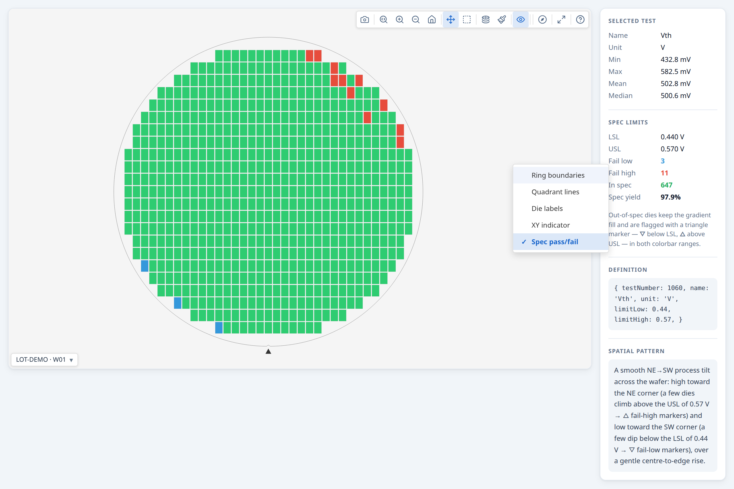
With passFailDisplay: 'spec' — a categorical pass/fail view instead of the continuous gradient, judged against the spec limits:
- Pass (in spec): green (#2ecc71)
- Fail low (below LSL): blue (#3498db)
- Fail high (above USL): red (#e74c3c)
- No data: grey
In this mode the colorbar is replaced by a spec legend showing the categories that apply (Pass always; Fail high / Fail low only when the test defines that limit) with per-category die counts. The title reads {test} · #{number} above the legend and Spec pass/fail below it.
const testDefs = [
  { testNumber: 1050, name: 'Idsat', unit: 'A' },
  {
    testNumber: 1060, name: 'Vth', unit: 'V',
    limitLow:  0.44,  // LSL — below this is a spec failure
    limitHigh: 0.57,  // USL — above this is a spec failure
  },
  { testNumber: 1070, name: 'Ioff', unit: 'A' },
];

const result = buildWaferMap({ results, waferConfig, dieConfig, testDefs });

// Enable pass/fail colouring for Vth to see spec status at a glance
renderWaferMap(container, result, {
  viewOptions: {
    plotMode:        'value',
    passFailDisplay: 'spec',
    activeTest:      1060,
    // testDefs inherited automatically from the result
  },
});
Spec limits also feed the stats engine: analyzeWaferMap populates summary.stats.testSpecYield with per-test spec yield, fail-low count, and fail-high count for every test that has at least one limit defined.
→ Demo: Working with test values
The same map with the view option 'Spec pass/fail' selected. Now the map shows the dies in spec limits in green and the dies out of limits in red, for the given test.
Functional tests (pass/fail only, no measured value)¶
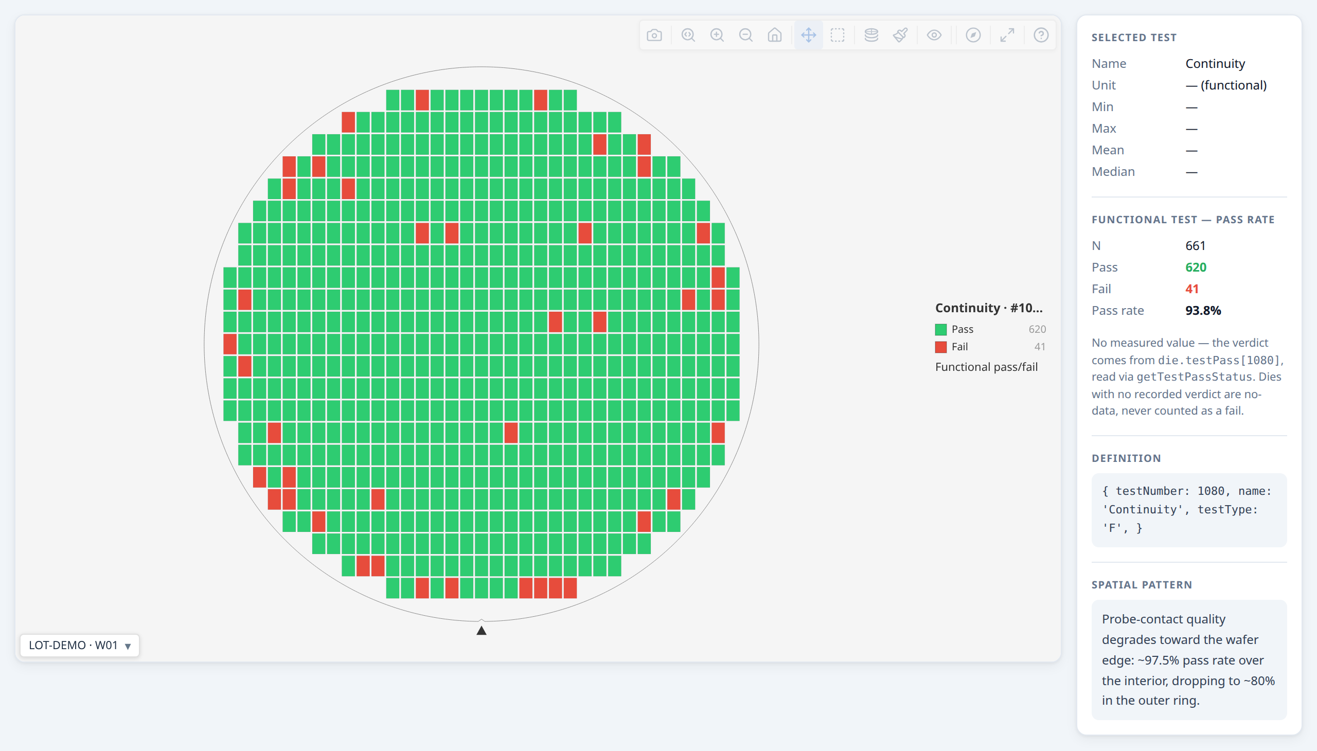
Not every test produces a number. A continuity check, a boundary-scan pass, or any go/no-go test has only an outcome — set testType: 'F' on that test's TestDef (default is 'P', parametric) and record the verdict on the die in testPass, keyed by testNumber the same way testValues is:
const testDefs = [
  { testNumber: 1050, name: 'Idsat', unit: 'A' },
  { testNumber: 1080, name: 'Continuity', testType: 'F' },  // no unit, no limits — verdict only
];

const results = [
  { x: 0, y: 0, hbin: 1, testValues: { 1050: 1.42e-3 }, testPass: { 1080: true } },
  { x: 1, y: 0, hbin: 2, testValues: { 1050: 1.38e-3 }, testPass: { 1080: false } },
  // ...
];

const result = buildWaferMap({ results, testDefs, passBins: [1] });
Selecting a functional test as the active test always renders as Test pass/fail (passFailDisplay: 'test') — coloured by the tester's recorded verdict from die.testPass, green pass / red fail, undirected (there is no "which side" the way spec limits have a high/low side). This is forced regardless of the requested display; a functional test has nothing to put on a gradient. The Overlays menu's "Test pass/fail" toggle is also available on a parametric test that happens to carry recorded verdicts (e.g. a tester-recorded PTR TEST_FLG), as an alternative to spec-limit judgement.
Functional tests are excluded from every parametric statistic — per-test stats, capability, correlation, distribution charts, value stacks, and regional value findings — since a mean or Cpk of a binary outcome is meaningless. They get their own pass-rate analysis instead: stats.functionalYield (one entry per functional test, with passDies/failDies/totalDies/passRatePercent), a Functional Tests table in the summary panel alongside — not replacing — the parametric Test values table, and regional pass-rate findings (kind: 'functionalTest').
Legacy encoding. If your data predates testPass and encodes a functional outcome as a testValues entry of 1 (pass) / 0 (fail), that keeps working — getTestPassStatus(die, testNumber, testDef) is the single read-path for verdicts everywhere in the library (rendering, stats, findings) and falls back to that encoding for a functional test with no testPass entry. New code should write testPass and leave functional tests out of testValues entirely.
Retests and enriching dies after build¶
Handling retests¶
If your data includes multiple probe results for the same die position (retests), the library handles them automatically. Four policies are available:
| Policy | Behaviour |
|---|---|
'last' (default) |
Keep the most recent result per position |
'first' |
Keep the earliest result per position |
'best' |
Keep the best result using passBins as the primary criterion: a pass always beats a fail. Within the same pass/fail category, lower hbin number wins. Falls back to 'last' when candidates have no hbin. |
'worst' |
Keep the worst result: a fail always beats a pass. Within the same category, higher hbin number wins. Falls back to 'last' when candidates have no hbin. |
const result = buildWaferMap({
  results:      rawResults,  // may contain the same (x,y) more than once
  retestPolicy: 'best',      // keep the best bin result per position
});

// Check which dies were retested:
result.dies.filter(d => d.retestCount !== undefined)
           .forEach(d => console.log(`(${d.x},${d.y}) retested ${d.retestCount}×`));
Retested dies automatically show "Retests: N" in their hover tooltip. retestCount is only set on dies that appeared more than once in the input — non-retested dies have retestCount === undefined.
Post-enrichment (attaching extra values after the map is built)¶
Sometimes you need to attach data that isn't in the same table as the grid positions — for example, merging test values from a separate parametric table into a map already built from a bin summary:
import { buildWaferMap, getDieKey } from '@wafertools/wafermap';

// Step 1: build the map from the bin data
const result = buildWaferMap({ results: binRows.map(r => ({
  x: Number(r.x), y: Number(r.y), hbin: Number(r.hbin),
})), dieConfig: { width: 10, height: 10 } });

// Step 2: build a lookup from the parametric table
const paramMap = new Map(paramRows.map(r => [getDieKey({ x: Number(r.x), y: Number(r.y) }), r]));

// Step 3: enrich dies in place
const enrichedDies = result.dies.map(die => {
  const row = paramMap.get(getDieKey(die));
  if (!row) return die;
  return { ...die, testValues: { 1050: Number(row.idsat), 1060: Number(row.vth) } };
});

// testDefs must be on the result so the stats engine and tooltips can read them
const testDefs = [
  { testNumber: 1050, name: 'Idsat', unit: 'A' },
  { testNumber: 1060, name: 'Vth',   unit: 'V' },
];

renderWaferMap(container, { ...result, dies: enrichedDies, testDefs });
Always use
getDieKey(die)for lookups rather than manually formatting"${die.x},${die.y}"— it guarantees the correct format after any grid offset correction.
Wafer vs. per-die metadata¶
Lot- and wafer-level facts — lot, product, test program, temperature, test date — belong on WaferMetadata, passed once via waferConfig.metadata. A die cannot differ from its wafer on these, so they live on the wafer and the tooltip reads them from there:
const result = buildWaferMap({
  results: rows.map(r => ({ x: Number(r.x), y: Number(r.y), hbin: Number(r.hbin) })),
  waferConfig: {
    metadata: { lot: 'LOT-001', product: 'NMOS-A', testProgram: 'NM_v3.2', temperature: 25 },
  },
  dieConfig: { width: 10, height: 10 },
});
Use the metadata field on a DieResult only for data that genuinely varies die-to-die — any key is accepted via the open index signature and shown in the tooltip:
results: rows.map(r => ({
  x: Number(r.x), y: Number(r.y), hbin: Number(r.hbin),
  metadata: { probeCard: r.probe_card, inkDate: r.ink_date },
})),
Metadata appears automatically in hover tooltips — no extra configuration. The tooltip merges the wafer's WaferMetadata (base) with the die's DieMetadata; a per-die key overrides the wafer value of the same name. null/undefined values are skipped. wmap renders whatever keys you supply, so you control tooltip content through the metadata you set.
Metadata also reaches the die-list table and its CSV export (API §5.4.4) — not only the tooltip. Die metadata is on by default, one column per key; wafer metadata is CSV-only by default, since it's constant down every row (screen noise) but exactly what makes a detached CSV self-describing enough to concatenate several wafers' exports and still know which wafer each row came from. Column labels use metadataFields[].label when declared, else a Title-Cased version of the key, matching the tooltip's own labels.
Changed in 0.15.0: wafer-level fields (
lotId,waferId,deviceType,testProgram,temperature) were removed fromDieMetadata— set them onWaferMetadatainstead. See the migration note in the changelog.
Read metadata back from the die in any callback:
renderWaferMap(container, result, {
  onClick: (die) => {
    console.log(die.metadata?.lotId);      // named field
    console.log(die.metadata?.probeCard);  // custom field
  },
});
Wafer-level metadata¶
Custom fields work the same way on waferConfig.metadata (WaferMetadata → §12.3). They appear in the summary panel header alongside the named fields:
const result = buildWaferMap({
  results: rows.map(r => ({ x: Number(r.x), y: Number(r.y), hbin: Number(r.hbin) })),
  dieConfig: { width: 10, height: 10 },
  waferConfig: {
    metadata: {
      lot:      'LOT123',
      waferId:  1,
      testDate: '2026-04-23',
      // custom fields — shown in summary panel header
      equipmentId: 'P-01',
      recipe:      'NMOS-R2',
    },
  },
});
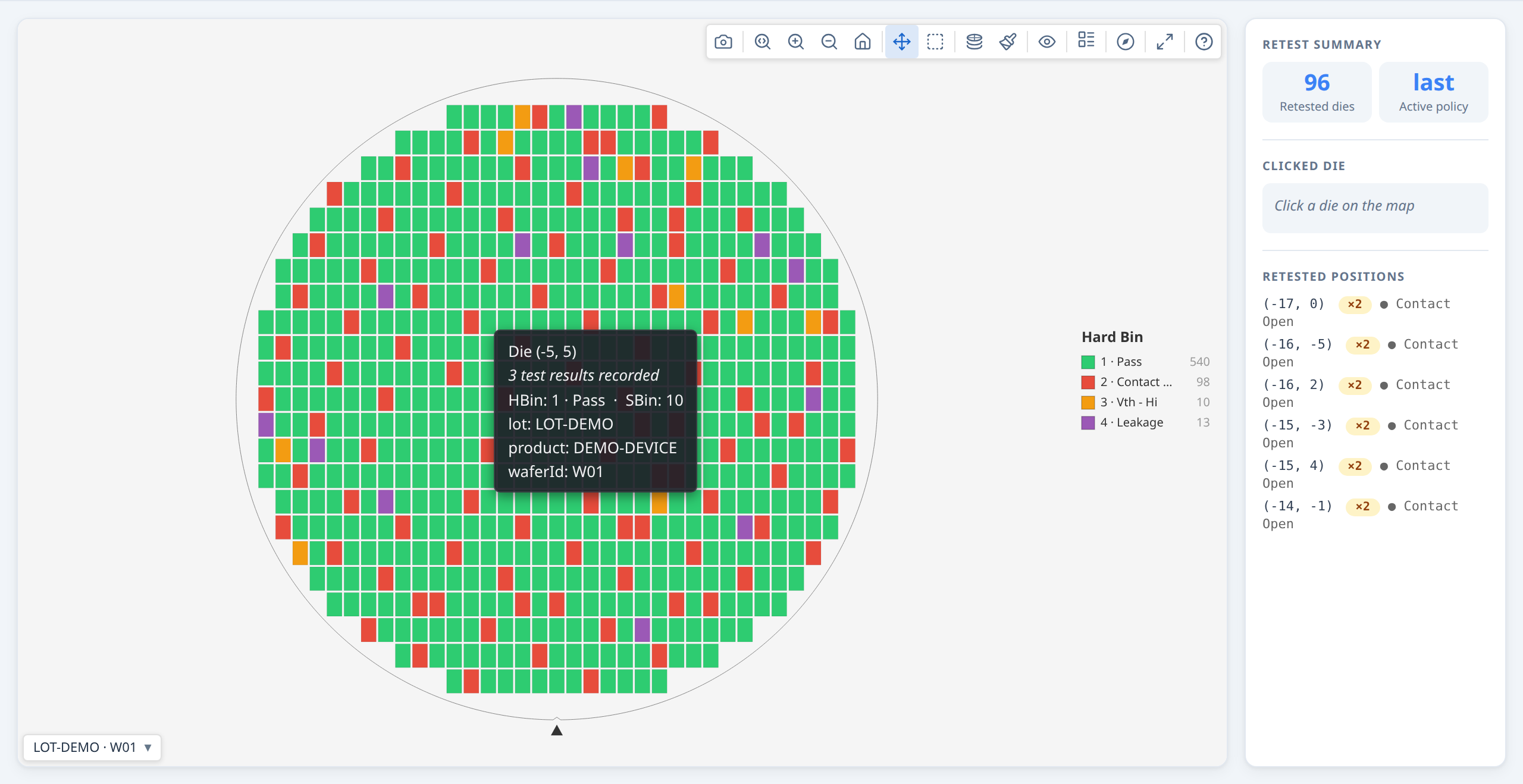
→ Demo: Working with retested dies
Controlling the display¶
Initial display options¶
Pass viewOptions to renderWaferMap to set the initial state:
renderWaferMap(container, result, {
  viewOptions: {
    plotMode:                'hardBin',
    binColorScheme:          'default',     // bin maps: 'default' | 'accessible' (colour-blind safe)
    valueColorScheme:        'default',     // value maps: 'default' (Viridis) | 'cividis' | 'plasma' | 'mako' | …
    reverseValueScheme:      false,         // flip the gradient end-for-end
    showRingBoundaries:      true,
    showQuadrantBoundaries:  false,
    showDieLabels:           false,         // die index labels
    showXYIndicator:         true,
    rotation:                0,             // 0, 90, 180, 270
    flipX:                   false,
    flipY:                   false,
    legendPosition:             'default',     // 'default'|'compact'|'left'|'top'|'bottom'|'floating'
  },
});
All of these can also be changed by the user via the toolbar at any time.
Programmatic control¶
renderWaferMap returns a controller you can call from application code:
const ctrl = renderWaferMap(container, result, { viewOptions: { plotMode: 'hardBin' } });

// Switch display mode (activeTest is a testNumber, e.g. from testDefs):
ctrl.setOptions({ plotMode: 'value', activeTest: 1050 });

// Replace the result (e.g. after a data reload) — preserves zoom/pan:
ctrl.setResult(newResult);

// Read current state:
const opts = ctrl.getOptions();
console.log(opts.plotMode, opts.binColorScheme, opts.valueColorScheme);

// Return to default zoom:
ctrl.resetZoom();

// Clean up when the component unmounts:
ctrl.destroy();
Syncing with external UI controls¶
Use onViewOptionsChange to keep your own UI elements in sync with the toolbar:
const ctrl = renderWaferMap(container, result, {
  viewOptions: { plotMode: 'hardBin' },
  onViewOptionsChange: (opts) => {
    modeDropdown.value     = opts.plotMode;
    schemeDropdown.value   = opts.valueColorScheme ?? 'default';
    ringsCheckbox.checked  = opts.showRingBoundaries ?? false;
  },
});

// When your own control changes, push it back:
modeDropdown.addEventListener('change', () => {
  ctrl.setOptions({ plotMode: modeDropdown.value });
});
onViewOptionsChangefires only when the toolbar changes options. Callingctrl.setOptions()programmatically does NOT re-fire it, so there is no feedback loop.
Hiding the toolbar¶
If you want a static display with no toolbar:
To keep your app's own mode controls in step with the toolbar, listen for changes:
renderWaferMap(container, result, {
  viewOptions: { plotMode: 'value' },
  onViewOptionsChange: (opts) => syncMyModeUI(opts),
});
Bin legend position¶
In hardBin and softBin modes, the bin legend can be placed in six positions via the Legend style toolbar button or the legendPosition option:
| Value | Behaviour |
|---|---|
'default' |
Vertical list on the right (full labels + counts). Auto-adapts: switches to compact below 280 px canvas width, floating below 180 px. |
'compact' |
Vertical list on the right (bin numbers only) |
'left' |
Vertical list on the left (full labels + counts) |
'top' |
Horizontal strip above the wafer (multi-column, auto-fitted) |
'bottom' |
Horizontal strip below the wafer (multi-column, auto-fitted) |
'floating' |
Draggable overlay, initially bottom-right (full labels + counts) |
Set the initial position via viewOptions — the user can change it at any time via the toolbar:
renderWaferMap(container, result, {
  viewOptions: { plotMode: 'hardBin', legendPosition: 'floating' },
});
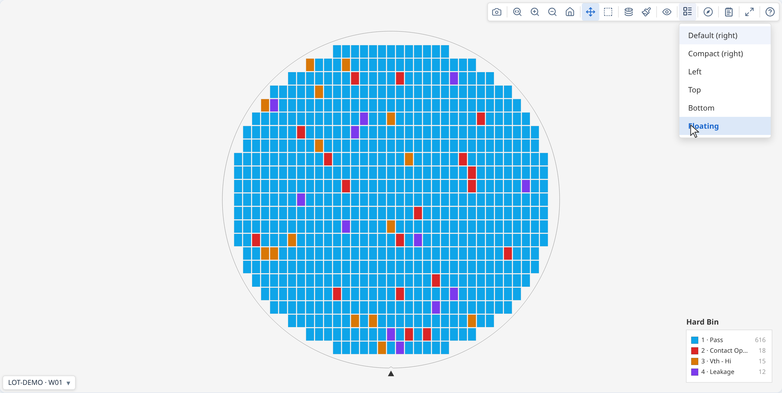
The Legend style button is automatically disabled when the map is in value or stacked mode, since those modes use a continuous colorbar instead of a bin legend.
For galleries, set it the same way; it applies to all cards:
Toolbar reference¶
The toolbar is always shown — at the top-right of a single map, or as a persistent bar above the gallery grid. Which buttons appear depends on the context and the current data.
Single map toolbar¶

| Button | Condition | What it does | |
|---|---|---|---|
 |
Download PNG | Always | Saves the current canvas at current zoom/rotation |
 |
Zoom mode | Always | Drag to zoom into a region |
   |
Zoom in / Zoom out / Reset | Always | Step zoom; Reset returns to fitted view |
 |
Pan mode | Always | Drag to pan |
 |
Box select | Always | Drag to select a group of dies; fires onSelect when provided |
 |
Plot mode | Always | Opens mode menu: Test Value, Hard Bin, Soft Bin, and Stacked modes (only when map was built with lotStack) |
 |
Colour palette | Always | Opens colour scheme picker |
 |
Log scale | Value / stacked-values mode only | Toggles log₁₀ colour normalisation; disabled when min ≤ 0; hidden whenever a solid pass/fail display is active or the active test is functional (log scale has no effect on pass/fail colouring) |
 |
Colorbar range | Value mode, test has limitLow or limitHigh, pass/fail display off |
Toggles the colorbar's numeric range between spec-limit range ([limitLow, limitHigh]) and data range (actual min/max). Out-of-spec dies are flagged with ▽/△ markers in both. |
 |
Overlays | Always | Dropdown: Ring boundaries, Quadrant lines, Die labels, Reticle grid (when reticles present), XY indicator, Spec pass/fail (value mode, test has limits), Test pass/fail (value mode, active test is functional or has recorded verdicts) |
 |
Legend style | Hard bin or soft bin mode only | Dropdown: legend position (default, compact, left, top, bottom, floating) |
 |
Orientation | Always | Dropdown: Rotate 90° CW, Flip horizontal, Flip vertical |
 |
Summary | Only when statsSummary is provided |
Toggles the Summary panel (metadata, yield, bins, ring/quadrant, test values, findings) |
 |
Insights | Only when insights: { enabled: true } |
Swaps the map for this wafer's own chart suite — see The Insights tab |
 |
Expand | Unless showExpandButton: false |
Opens the map in an enlarged modal overlay; canvas reparented — no view rebuild. A maximise button in the modal grows it to fill the window (F). E key shortcut (also disabled when showExpandButton: false). Hidden (and E disabled) while the Insights tab is open — see below. |
 |
User guide | Only when showHelpButton: true |
Opens the built-in end-user guide — a real, separate window when available, falling back to an in-page non-modal floating window when window.open is blocked (some embedded WebViews). Callable directly via openUserGuide() regardless of showHelpButton. userGuideExtension inserts a host app's own documentation into it, see API reference |
A gallery card's detached window shows the full toolbar. In the gallery, cards show only the navigation controls (download, zoom, pan, select) — the view controls (mode, overlays, orient, etc.) live in the shared gallery bar.
While the Insights tab is open, every button above except Insights and User guide is hidden — none of the others (download, zoom/pan/select, mode, palette, overlays, legend, orientation, Expand) apply to the chart suite underneath, and Findings specifically toggles the map's own findings panel, which sits behind the Insights tab's opaque overlay with no visible effect while it's open. Expand is hidden rather than repurposed: each chart panel inside Insights has its own expand button for enlarging that one chart instead.
Gallery control bar¶

The gallery control bar is always visible above the card grid.
| Button | Condition | What it does | |
|---|---|---|---|
|
Plot mode | Always | Same mode menu as single map; stacked modes always available in the gallery |
|
Colour palette | Always | Colour scheme picker; applies to all cards |
 |
Aggregation method | Stacked Test Values mode only | Selects mean, median, std dev, min, max, or count; re-aggregates all cards immediately |
|
Log scale | Value / stacked-values mode only | Applies to all cards |
|
Colorbar range | Value mode, active test has limitLow or limitHigh, pass/fail display off |
Toggles the colorbar's numeric range: spec-limit range ↔ data range. Out-of-spec dies are flagged with ▽/△ markers in both; applies to all cards |
|
Overlays | Always | Dropdown: Ring boundaries, Quadrant lines, Die labels, Reticle grid (when any card has reticles), XY indicator, Spec pass/fail (value mode, active test has limits), Test pass/fail (value mode, active test is functional or has recorded verdicts) — applies to all cards |
|
Legend style | Always | Dropdown: Legend on each map toggle (off by default — the lot legend strip stands in for it), then the per-card legend position, available only while that toggle is on and in a bin or metadata mode |
|
Orientation | Always | Dropdown: Rotate 90° CW, Flip horizontal, Flip vertical — applies to all cards |
 |
Columns | Always | Dropdown: fix the column count to 1–5, or choose Auto to let the gallery size columns based on die pitch. Cards are size-capped and pack from the left rather than stretching to fill the width |
 |
Download all | Always | Exports all cards as a single tiled PNG |
|
Summary panel | Only when lotStatsSummary is provided |
Toggles the summary and findings panel covering every wafer in the gallery |
|
Insights | Only when insights: { enabled: true } |
Swaps the grid for a chart suite covering every wafer — see The Insights tab |
|
User guide | Only when showHelpButton: true |
Opens the built-in end-user guide — a real, separate window when available, falling back to an in-page non-modal floating window when window.open is blocked (some embedded WebViews). Callable directly via openUserGuide() regardless of showHelpButton. userGuideExtension inserts a host app's own documentation into it, see API reference |
While the Insights tab is open, every button above except Insights and User guide is hidden — none of the others (mode, palette, overlays, columns, download, etc.) apply to the chart suite underneath, and Summary panel specifically toggles the panel inside the grid body, which is already hidden while the Insights tab is showing.
Theming the chrome¶
wmap's chrome — the toolbar, gallery cards, summary panel, menus, tooltip — and the wafer canvas (background, axis labels, grid) are themed through --wmap-* CSS custom properties. Set them on any ancestor of the render container and everything wmap draws follows. Every token has a light default, so you override only what differs; a host that sets nothing gets the default light appearance.
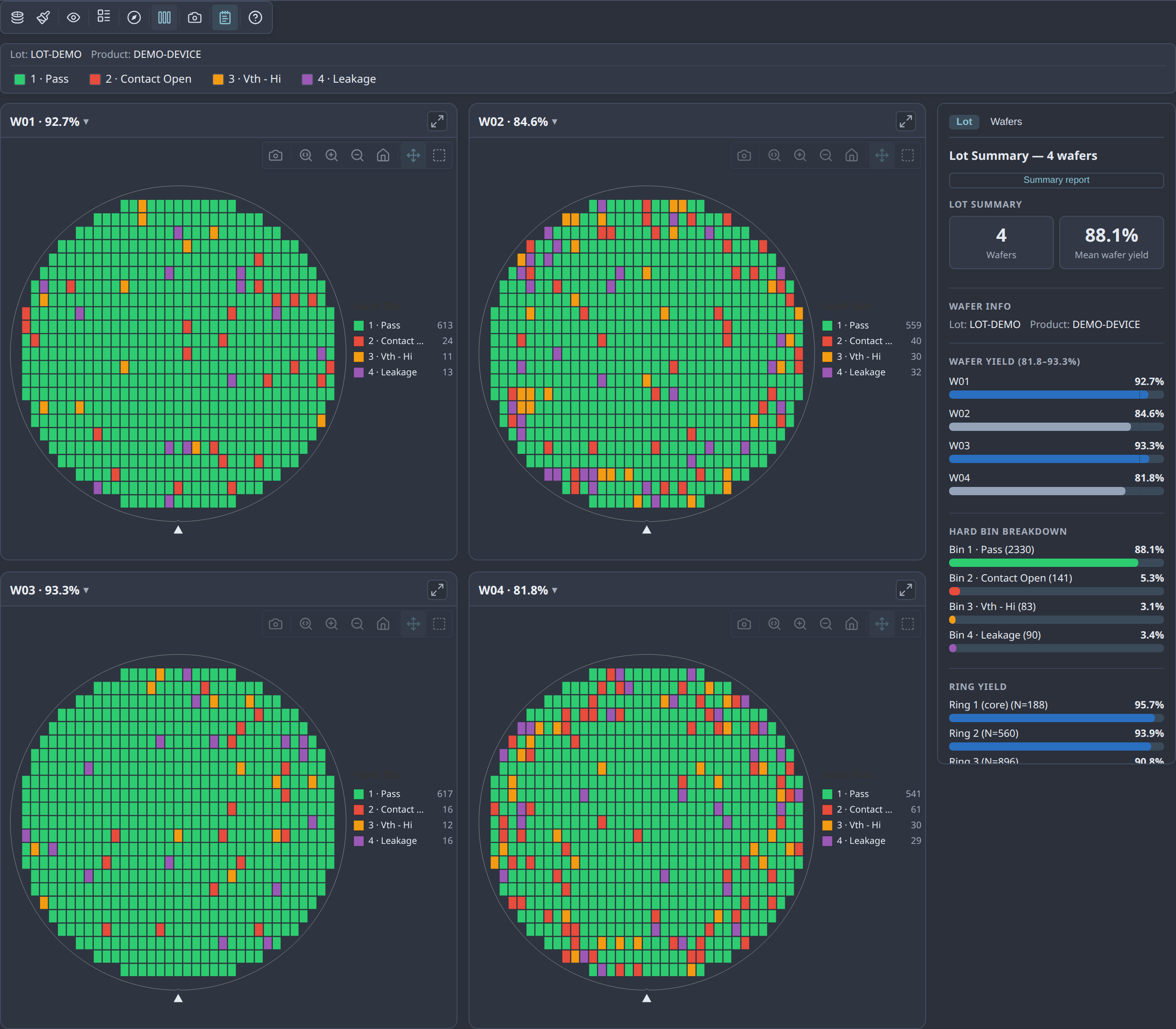
/* The Nord theme shown above — set on a wrapper around the render container */
.my-nord-wrap {
  --wmap-canvas-bg:   #2e3440;   /* the wafer canvas */
  --wmap-surface:     #323846;   /* cards, menus, toolbar */
  --wmap-panel-bg:    #2b303b;   /* summary panel */
  --wmap-border:      #434c5e;
  --wmap-text:        #e5e9f0;
  --wmap-text-muted:  #a6adbb;
  --wmap-icon:        #d8dee9;
  --wmap-icon-hover:  #88c0d0;   /* accent — hover/active affordances */
  --wmap-icon-active: #88c0d0;
  --wmap-selected:    #88c0d0;   /* finding-drilldown card outline */
  /* …see the full token table in the API reference… */
}
To follow the OS preference, put the light values on :root and override in a @media (prefers-color-scheme: dark) block. Canvas colours are re-resolved on a theme change or light/dark flip, so the wafer repaints to match.
The data palette (the bin/value colours of the dies) is separate — it's controlled by binColorScheme and valueColorScheme (see Custom colour schemes), not these tokens, and does not follow the chrome accent.
→ Demo: Theming with --wmap-* tokens · full token reference in the API docs
Responding to user interaction¶
Click and hover callbacks¶
renderWaferMap(container, result, {
  onClick: (die, event) => {
    console.log(`Clicked die (${die.x}, ${die.y})`);
    console.log('Hard bin:', die.hbin);
    console.log('Test values:', die.testValues);
    showDetailPanel(die);
  },
  onHover: (die, event) => {
    if (die) updateStatusBar(`(${die.x}, ${die.y})`);
    else     clearStatusBar();
  },
});
onClick and onHover receive the full Die object — die.x, die.y, die.testValues,
die.hbin, die.sbin, and any metadata you attached. onHover receives null when the cursor
leaves a die.
Box selection¶
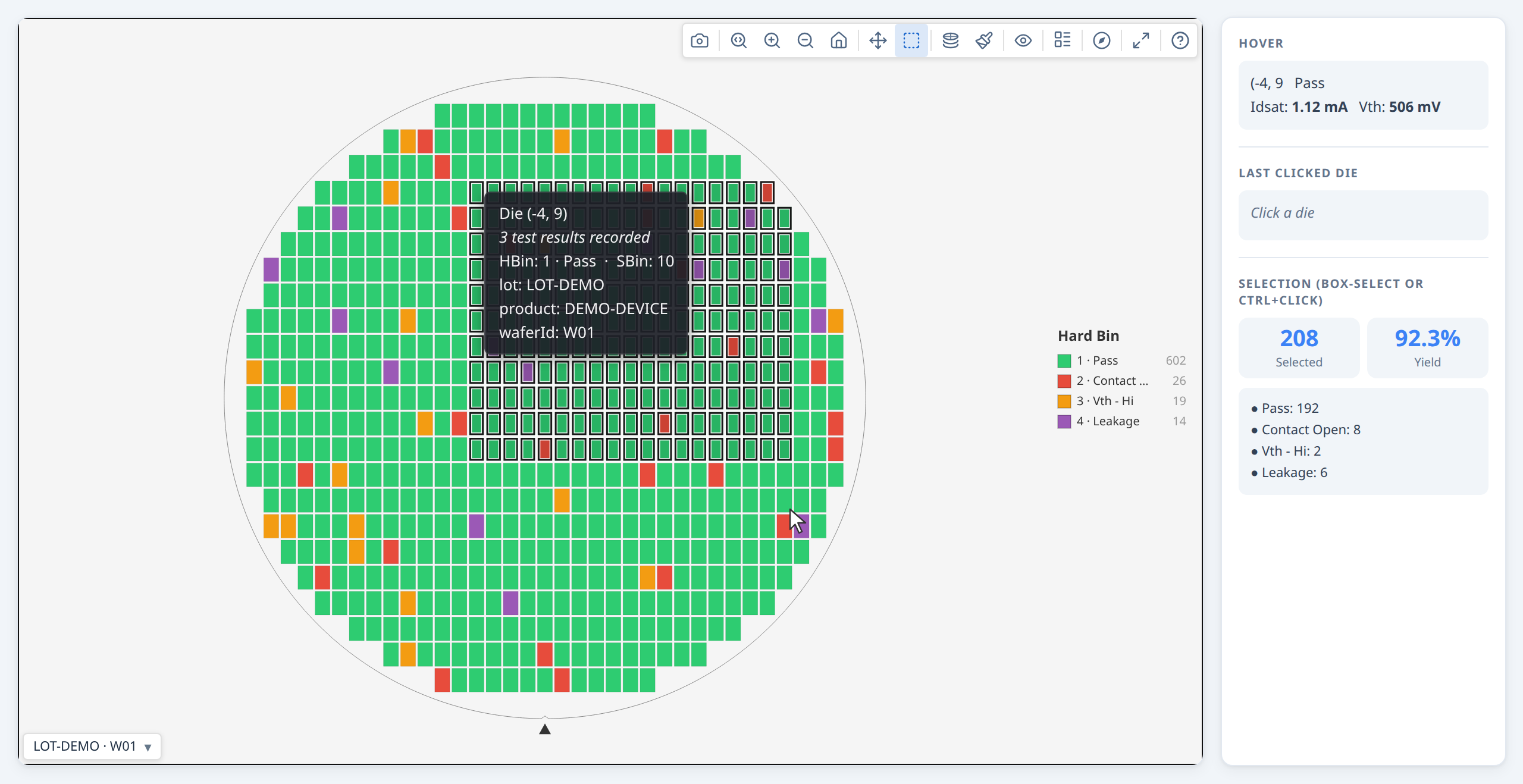
The box-select button is always in the toolbar. Provide onSelect to receive the selected dies when the user finishes a drag selection:
renderWaferMap(container, result, {
  onSelect: (selectedDies) => {
    console.log(`${selectedDies.length} dies selected`);
    const passing = selectedDies.filter(d => d.hbin === 1).length;
    showSelectionStats({ count: selectedDies.length, passing });
  },
});
Users can also click individual dies, Ctrl/Cmd+click to add to the selection, and press Esc to clear.
Programmatic selection¶
// Highlight a specific set of dies (e.g. from a table click):
const failingDies = result.dies.filter(d => d.hbin === 2);
ctrl.setSelection(failingDies);

// Clear:
ctrl.clearSelection();
Bin legend filter¶
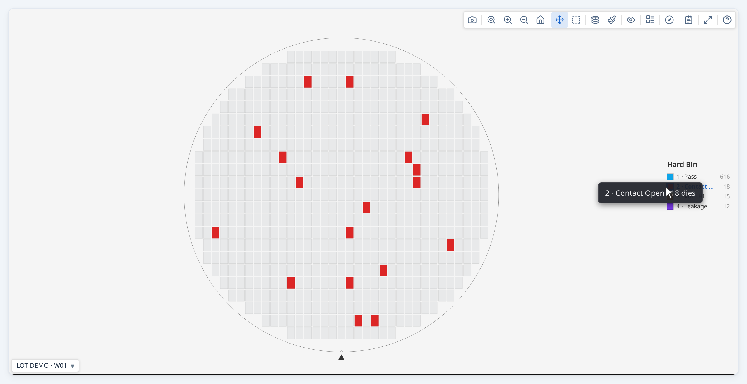
In hardBin and softBin modes, clicking any row in the bin legend dims all dies that do not belong to that bin — making it easy to isolate a single failure category across the wafer. Click the same row again to clear the filter.
// Equivalent programmatic control:
ctrl.setOptions({ highlightBin: 2 });   // isolate bin 2
ctrl.setOptions({ highlightBin: undefined }); // clear
The filter also works in gallery view — clicking a legend row in the gallery toolbar highlights that bin across every card simultaneously.
Adding statistical findings¶
The statistics engine (analyzeWaferMap) scans for spatial patterns across five families: rings, quadrants, angular sectors, contiguous failure clusters, and edge arcs. For each family it compares the local zone to the rest of the wafer using a statistical test appropriate to the variable type.
It also runs a spatial pattern classifier that labels the overall failure signature of the wafer — edge-ring, center cluster, scratch, and so on. This operates separately from the zone-by-zone statistical tests: the statistical findings are the evidence, the pattern label is the interpretation. See Spatial Pattern Detection for how the classifier works, what it was tested on, and its known limitations.
Basic usage¶
Pass the result of analyzeWaferMap to renderWaferMap as statsSummary.
That's all most users need — the library handles the rest.
import { buildWaferMap } from '@wafertools/wafermap';
import { renderWaferMap } from '@wafertools/wafermap/render';
import { analyzeWaferMap } from '@wafertools/wafermap/stats';  // note: /stats subpath, not root

const result  = buildWaferMap({ results, waferConfig, dieConfig, passBins: [1] });
const summary = analyzeWaferMap(result);   // passBins inferred from result — no need to repeat it

renderWaferMap(container, result, {
  statsSummary: summary,
});
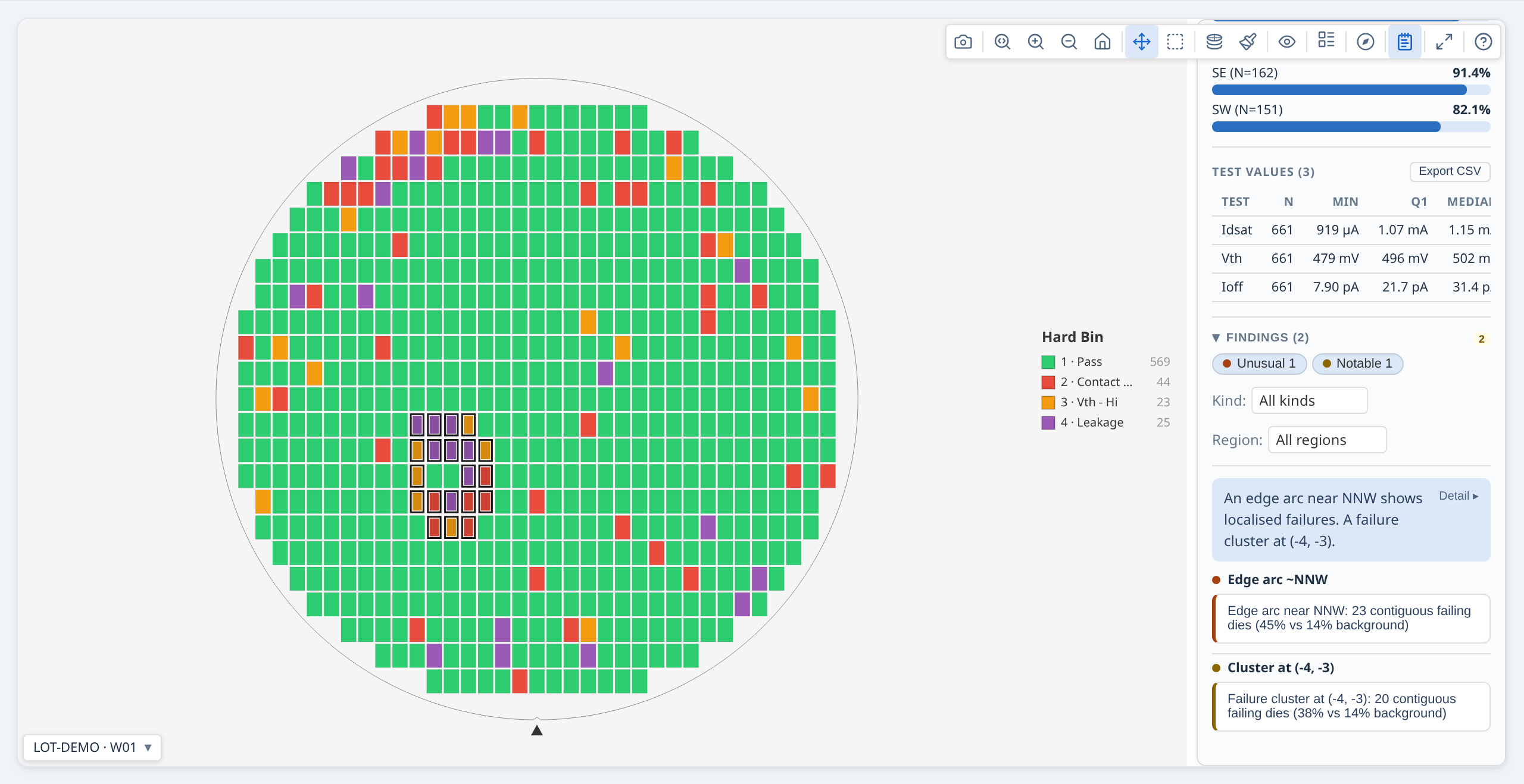
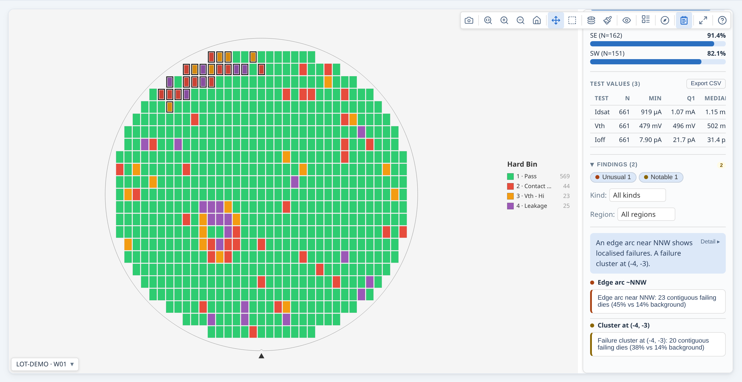
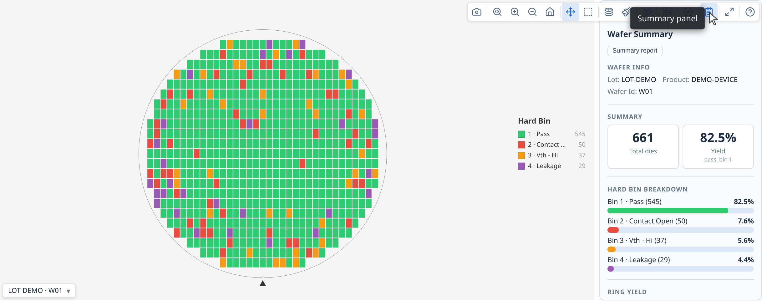
A "Findings" button (notebook icon) appears in the toolbar. Clicking it opens the summary panel — a persistent results panel alongside the map showing yield, bin distribution, ring and quadrant stats, test value summaries, and the full findings list. Clicking any finding in the panel highlights the affected dies on the map. See Summary panel for the full panel content reference and configuration options (auto-open, pinned placement, gallery use).
When you pass a WaferMapResult to analyzeWaferMap, the passBins you gave to
buildWaferMap are carried through automatically. analyzeWaferMap has no passBins option of
its own: pass bins are set once, on buildWaferMap.
What gets analysed¶
By default the engine checks every combination of:
- Ring zones — each concentric ring vs. the rest of the wafer
- Quadrant zones — each of NE/NW/SE/SW vs. the rest of the wafer
- Angular sectors — 16 compass-direction sectors (N, NNE, NE, …) vs. the rest of the wafer; finer directional resolution than quadrants, catching drift patterns a single quadrant would dilute
- Reticle-field positions — each reticle cell vs. other cells (only when a
reticleConfigwas used) - Failure clusters — contiguous groups of failing dies that are denser than the wafer-wide background failure rate; each cluster highlighted as a specific set of dies
- Edge arcs — failure clusters whose centroid is near the wafer perimeter and whose angular span is narrow; distinguished from full-ring edge effects (which ring analysis catches separately)
For each spatial family the engine tests: yield, hard bin rate per bin, soft bin rate per bin, and mean test value per test.
Angular sectors in detail. Sector analysis divides the wafer into compass-named angular slices — N, NNE, NE, ENE, E, … (16 sectors by default). Each sector is compared to the rest of the wafer independently, giving finer directional resolution than quadrants: a drift pattern concentrated in the NE corner shows up as a sector finding even if the wider NE quadrant is diluted by clean dies elsewhere in that quarter. Dies within 0.2 normalised radius of the wafer centre are excluded from sector analysis (they are too close to the centre to be meaningfully attributed to a direction). The number of sectors is controlled by sectorCount (4, 8, 16, or 32).
Findings are suppressed unless they pass both an adjusted p-value threshold and an effect size gate. The effect size gate uses two complementary criteria — absolute and relative — so that meaningful patterns are not missed on wafers with either high or low background failure rates.
Clicking a finding highlights the map¶
When the user clicks a finding row in the panel, the map automatically: 1. Switches to the most relevant display mode (value mode for test findings, bin mode for bin findings) 2. Highlights the affected die zone with an amber overlay
Clicking the finding again clears the highlight.
Interpreting findings and severity¶
The findings list is ranked and filtered by statistical strength and effect size:
These thresholds are internal constants, not options — see §7.3 of the API reference for why. They are documented here so you can tell why a pattern did or did not produce a finding.
- p-value correction: adjusted p-values are used (threshold 0.05), corrected per-family using a Benjamini–Hochberg FDR procedure.
- Effect size gate for yield/bin/cluster findings: a finding passes if it satisfies at least one of:
- absolute
|delta| ≥ 0.20, i.e. a 20 percentage-point difference, or - relative
|delta / background| ≥ 1.0, i.e. at least a doubling of the wafer-wide background rate
The relative criterion matters on low-failure-rate wafers. With a 2% background rate, a 4 percentage-point elevation is only 0.04 in absolute terms — well below the 0.20 gate — but is a 200% relative deviation, and is kept. Without the relative criterion that finding would be silently dropped. (A 2-point elevation on the same background is a 100% deviation and only just clears it; a 1-point elevation clears neither gate and produces nothing.)
- Effect size for test-value findings: Cohen's d (pooled SD). Only the absolute gate applies; relative effect is not used for continuous measurements.
- Minimum sample size per region is auto-scaled to roughly 1% of wafer die count (minimum 5). Regions smaller than this are not tested.
Severity is derived from the adjusted p-value and the strongest satisfied effect criterion:
| Severity | p-value | Absolute delta | or Relative delta |
|---|---|---|---|
unusual |
≤ 0.01 | ≥ 0.30 | ≥ 2.5× background |
notable |
≤ 0.05 | ≥ 0.20 | ≥ 1.5× background |
info |
any other passing finding |
Cluster and edge-arc findings have an additional size criterion applied after the rate-based gate above. A large contiguous cluster is intrinsically striking even when the background failure rate is elevated (e.g. a 500-die donut ring that forms its own high background). The size thresholds are:
| Severity | Cluster size (% of eligible wafer dies) |
|---|---|
unusual |
≥ 10% |
notable |
≥ 3% |
A cluster qualifies for a severity level if it satisfies either the rate criterion or the size criterion (both require the p-value gate).
Use the summary, effect, and stats fields on each StatsFinding to display numerical details to users.
Controlling what is analysed¶
const summary = analyzeWaferMap(result, {
  // significanceLevel / minimumEffectSize / minimumRelativeEffect were REMOVED in
  // 0.27.0 — they are internal constants now. They set what counts as a finding,
  // so a wrong value made the output wrong rather than merely different, and did
  // so silently. See "Interpreting findings and severity" above for the values.
  enableTestValueAnalysis:   true,   // default FALSE — opt in for regional test-value findings (expensive);
                                     // use computePerTestStats: true for box-plot stats without the Welch pass
  sectorCount:               8,      // 4 | 8 | 16 | 32
});
How the analysis is structured: variable × region¶
Regional analysis has two independent axes, and it helps to keep them separate:
- What is measured (the variable): yield, hard bin, soft bin, or test value.
- Where it is measured (the region family): rings, quadrants, sectors, reticle positions, or test sites.
Every enabled variable is compared across every enabled region family — they form a grid. Sectors, reticle positions, and test sites are not specific to any one variable: if reticle analysis is on, you get yield and bin and (when enabled) test-value findings broken down by reticle position, exactly as you do for rings.
| Rings | Quadrants | Sectors¹ | Reticle² | Test sites³ | |
|---|---|---|---|---|---|
| Yield | ✓ | ✓ | ✓ | ✓ | ✓ |
| Hard bin | ✓ | ✓ | ✓ | ✓ | ✓ |
| Soft bin | ✓ | ✓ | ✓ | ✓ | ✓ |
Test value (enableTestValueAnalysis) |
✓ | ✓ | ✓ | ✓ | ✓ |
The column toggles control which region families are built at all:
- Sectors — always built, with
sectorCountslices. - Reticle positions — built only when a reticle configuration is present; otherwise skipped automatically.
- Test sites — built only when the wafer has meaningful site duplication (≥ 2 distinct
siteNumvalues, each on ≥ 3 dies).
Rings and quadrants are always built. The row toggles control which variables are compared across whatever families exist.
Which test-value setting to use¶
The test-value row is off by default because it is the expensive one — it runs a Welch comparison for every test across every region, scaling with regions × tests × dies. Leaving it off costs you nothing on yield or bins; you lose only the parametric (measured-value) findings. Choose based on what you need:
| You want… | Pass | Relative cost |
|---|---|---|
| Yield, bin, and spatial (ring/quadrant/sector/cluster) findings only | (nothing — this is the default) | baseline |
| …plus per-test descriptive stats (mean, stddev, min, max, median, Q1, Q3) for box plots / histograms | computePerTestStats: true |
~5× baseline |
| …plus "this test's value differs significantly in this region" findings (and spec-limit region findings) | enableTestValueAnalysis: true |
~12× baseline |
enableTestValueAnalysis also produces the per-test descriptive stats, so you never need both. The cost multipliers are illustrative (measured at ~2.8k dies × 200 tests); the absolute numbers scale with your test count.
→ Demo: Summary panel uses computePerTestStats: true to populate the per-test value section of the panel.
See also: Demo: Standalone stacked map with spatial analysis, which uses enableTestValueAnalysis: true to surface regional test-value findings on a lot-averaged map.
Cluster and edge-arc highlights¶
Cluster and edge-arc findings use { kind: 'dies' } highlights — they identify the exact set of failing dies, not a region. Clicking one in the summary panel highlights those specific dies on the map:
const clusters = filterFindings(summary, { family: 'cluster' });
const arcs     = filterFindings(summary, { family: 'edge-arc' });
const sectors  = filterFindings(summary, { family: 'sector' });

// Each cluster finding's highlight carries the exact die keys:
for (const f of clusters) {
  console.log(f.comparison.left);    // e.g. "Cluster at (3, 2)"
  console.log(f.highlight.dieKeys);  // ['3,2', '4,2', '3,3', ...]
}
Reading findings in code¶
If you need to drive your own UI from findings rather than using the built-in
panel, each finding is a StatsFinding with a human-readable summary and
structured data:
for (const finding of summary.findings) {
  console.log(finding.severity);          // 'unusual' | 'notable' | 'info'
  console.log(finding.summary);           // "Ring 3 (edge) yield is lower than the rest of the wafer"
  console.log(finding.variable.kind);     // 'yield' | 'hardBin' | 'softBin' | 'test'
  console.log(finding.effect.absoluteDelta);  // signed magnitude of the effect
  console.log(finding.stats.adjustedPValue);  // BH-adjusted p-value
}
summary.findings is sorted by severity — 'unusual' first, then 'notable', then 'info'.
findings[0] is always the highest-severity finding; no manual sort needed.
De-duplicating for display¶
summary.findings is the complete list, including findings that restate one
another. Several passes legitimately detect the same phenomenon, so one edge
failure can appear as a hard-bin row, its soft-bin twin with an identical delta,
a pass-bin row, and a yield row saying the same thing as the pass-bin row.
The library marks these: a finding's absorbedIds names the findings it
restates. The built-in panel and report hide them; if you are driving your own
UI, do the same, or you will show one fact several times:
const absorbed = new Set(summary.findings.flatMap(f => f.absorbedIds ?? []));
const forDisplay = summary.findings.filter(f => !absorbed.has(f.id));
The surviving finding's summary names what it absorbed — for example
"Ring 4 (edge) has hard bin 3 and soft bin 3 (same dies) occurrence 8.8
percentage points higher…"
— so nothing is silently lost from the sentence.
Everything absorbed is still in summary.findings and still returned by
filterFindings; the collapse is display-only.
Note relatedIds is a different relationship and is not interchangeable: it
records a finding's finer-grained supporting detail, and some of the ids it names
were replaced by a merge and no longer exist in findings.
Updating findings after a data change¶
// After rebuilding the map with new data (newResult = buildWaferMap(...)):
ctrl.setResult(newResult);
const newSummary = analyzeWaferMap(newResult);
ctrl.setStatsSummary(newSummary);
A finding object in full:
{
  id:       'ring:Ring 4 (edge)',
  level:    'wafer',
  severity: 'unusual',            // 'unusual' > 'notable' > 'info'
  variable: { kind: 'yield', label: 'Yield' },
  comparison: { family: 'ring', left: 'Ring 4 (edge)', right: 'Rest of wafer' },
  effect:   { direction: 'lower', absoluteDelta: -0.18, relativeDelta: -0.62 },
  stats:    { method: 'z', pValue: 0.003, adjustedPValue: 0.009,
              sampleSizeLeft: 48, sampleSizeRight: 412 },
  summary:  'Ring 4 (edge) yield is lower than the rest of the wafer',
  highlight: { kind: 'region', regionFamily: 'ring', regionKeys: ['ring:4'], dieKeys: ['6,0', '6,1', /* … */] },
}
Use finding.summary for display text. Use finding.highlight to programmatically
select or colour dies associated with the finding.
For running the stats engine in Node.js without a browser, see the Analyse a lot in Node.js without a browser recipe.
Summary panel¶
The summary panel is a persistent results panel that sits alongside the wafer map. It shows yield, bin distribution, ring and quadrant statistics, test value summaries, and the full findings list — all in one place without requiring the user to open the toolbar findings button.
Adding a summary panel to a single map¶
Pass statsSummary to renderWaferMap and the Summary button appears in the toolbar
automatically. The panel is hidden by default; clicking the button toggles it open:
import { buildWaferMap } from '@wafertools/wafermap';
import { renderWaferMap } from '@wafertools/wafermap/render';
import { analyzeWaferMap } from '@wafertools/wafermap/stats';

const result  = buildWaferMap({ results, waferConfig, dieConfig, passBins: [1] });
const summary = analyzeWaferMap(result);

renderWaferMap(container, result, {
  statsSummary: summary,
});
To start with the panel already open (no toolbar click required), add
summaryPanel: { defaultOpen: true }:
The toolbar Summary button reflects the current open/closed state, and the user can
still toggle the panel closed via that button. Combine with a placement to pin the
panel to a specific side of the canvas without the toggle behaviour:
renderWaferMap(container, result, {
  statsSummary: summary,
  summaryPanel: { placement: 'right' },   // always visible; no toggle
});
What the panel shows¶
The panel is divided into sections:
| Section | Content |
|---|---|
| Yield | Pass count, fail count, yield %, edge-excluded count |
| Hard Bins | Count and percentage per bin; colour-coded |
| Soft Bins | Count and percentage per soft bin (when sbin data is present) |
| Ring analysis | Per-ring yield breakdown (Ring 1 = centre, Ring N = edge) |
| Quadrant analysis | Per-quadrant yield and die count |
| Test values | Min, mean, max per parametric test parameter (testType unset or 'P') — labelled by TestDef.name when provided, otherwise Test {N} using the testNumber |
| Functional Tests | Pass/fail counts and pass rate per functional test (testType: 'F') — shown instead of mean/max, since a functional test has no measured value; only appears when at least one functional test has data |
| Findings | All StatsFinding entries grouped by severity — clicking a finding highlights the affected die zone on the map |
Updating the panel after data changes¶
const ctrl = renderWaferMap(container, result, { statsSummary: summary });

// After a data reload (newResult = buildWaferMap(...)):
ctrl.setResult(newResult);
const newSummary = analyzeWaferMap(newResult);
ctrl.setStatsSummary(newSummary);
Summary panel in a gallery¶
For a gallery, call analyzeWaferLot and pass the result as lotStatsSummary — that's all you need. analyzeWaferLot runs per-wafer analysis internally, so the result contains complete findings for every wafer. A "Summary" button appears in the control bar opening one panel — no tabs — with:
- lot-level findings: cross-wafer patterns and yield outliers
- a Wafer Yield section listing every wafer, each row badged with its own findings count; clicking a row detaches that wafer's card into its own window with its summary panel
- a Findings report button covering every wafer's findings in one printable document
See Lot-level statistical findings for the full example.
If you are building a gallery without lot-level analysis — for example, a set of unrelated wafers — you can attach statsSummary to each item individually:
const items = waferResults.map((r, i) => ({
  ...r,
  label:        `Wafer ${i + 1}`,
  statsSummary: analyzeWaferMap(r),
}));

renderWaferGallery(container, items);
// → Summary panel button appears in the toolbar, listing the wafers with findings
// → Each card's own window shows its own per-wafer summary
Building a lot gallery¶
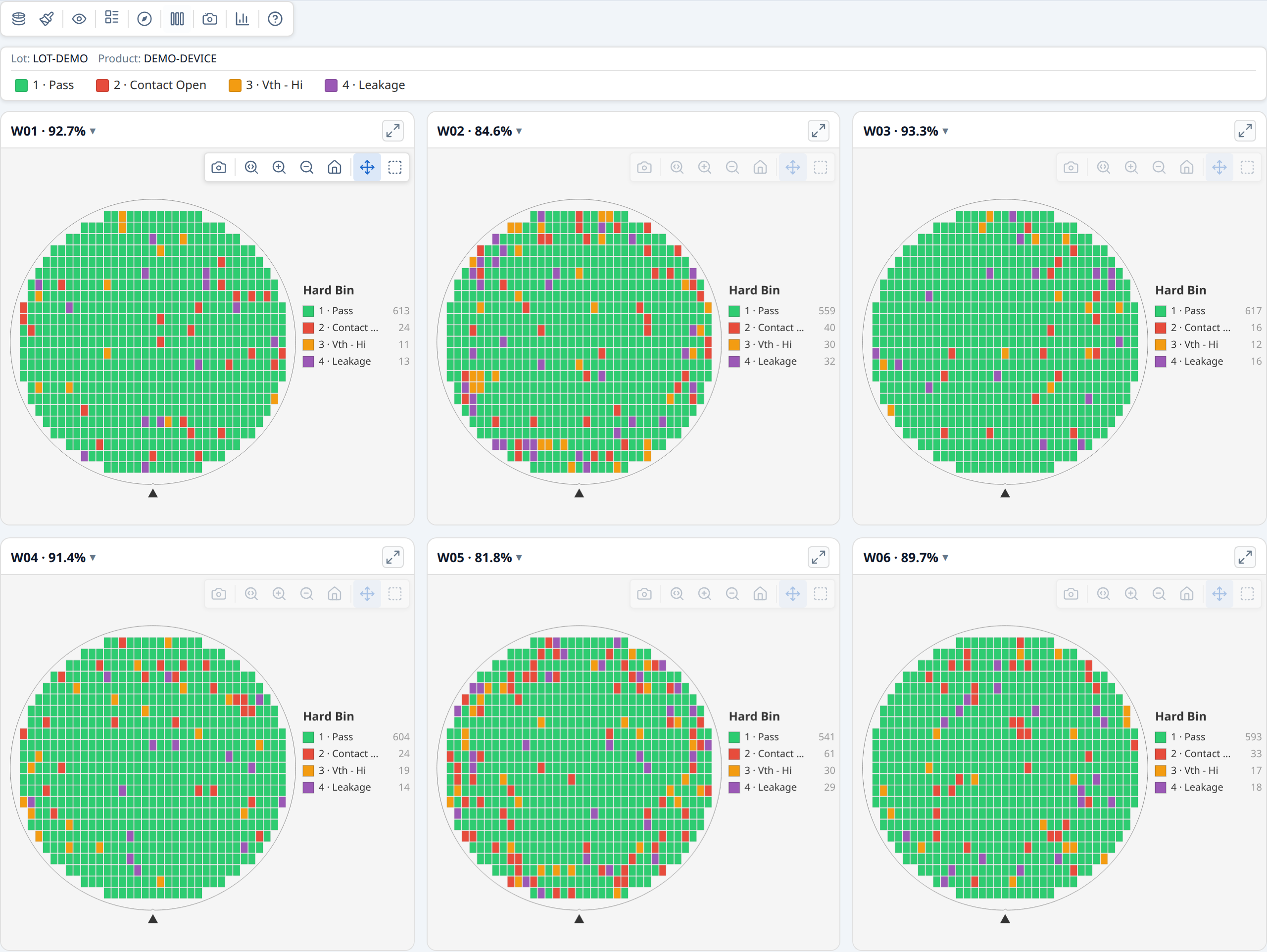
renderWaferGallery renders multiple wafer maps in a responsive card grid. All cards share a single control bar —
changing mode, colour, rotate, or flip applies to every card at once.
The gallery container needs a width but not a fixed height — the grid grows
to fit its cards automatically. width: 100% is the typical choice:
The toolbar and legend are position: sticky, so they stay visible while the grid
scrolls. Stickiness needs a scrolling ancestor with a bounded height and
overflow-y: auto (or scroll) — the container itself, or any parent. Without one,
the toolbar and legend just scroll away with the grid as before; nothing breaks,
they're simply not sticky.
Basic gallery¶
import { buildWaferMap } from '@wafertools/wafermap';
import { renderWaferGallery } from '@wafertools/wafermap/render';

// Build a result per wafer
const waferResults = waferDatasets.map(data =>
  buildWaferMap({
    results:     data.map(r => ({ x: +r.x, y: +r.y, hbin: +r.hbin, sbin: +r.sbin })),
    waferConfig: { diameter: 300, notch: { type: 'bottom' } },
    dieConfig:   { width: 10, height: 10 },
    hbinDefs,
    sbinDefs,
  })
);

// Build gallery items
const items = waferResults.map((r, i) => ({
  ...r,
  label: `Wafer ${i + 1}`,
}));

const ctrl = renderWaferGallery(
  document.getElementById('gallery'),
  items,
  { viewOptions: { plotMode: 'hardBin' } },
);
Cards reflow responsively as the container resizes. Each card has an expand button (↗) in its header — clicking it detaches that card into its own real, separate window (not an in-page overlay), so it can be moved anywhere on screen, including outside the host app's own window. The gallery grid stays fully interactive the whole time, and any number of cards can be detached at once. See §6.6 Detaching a card into its own window in the API reference for reattach, multi-window, and embedded-host (Tauri/Electron) details.
Sharing bin and test definitions across cards¶
Pass hbinDefs, sbinDefs, and testDefs to buildWaferMap — they are stored
on each WaferMapResult and flow automatically to the gallery's shared legend and
tooltips:
const waferResults = waferDatasets.map(data =>
  buildWaferMap({
    results: data.map(r => ({ x: +r.x, y: +r.y, hbin: +r.hbin, sbin: +r.sbin })),
    hbinDefs: [
      { bin: 1, name: 'Pass',  color: '#2ecc71' },
      { bin: 2, name: 'Fail',  color: '#e74c3c' },
    ],
    sbinDefs: [
      { bin: 10, name: 'Vth - Lo' },
      { bin: 11, name: 'Vth - Hi' },
    ],
    testDefs: [
      { testNumber: 1050, name: 'Idsat', unit: 'A' },
      { testNumber: 1060, name: 'Vth',   unit: 'V' },
    ],
  })
);

renderWaferGallery(container, items, { viewOptions: { plotMode: 'hardBin' } });
Per-card overrides¶
Each WaferMapDisplayItem can override any viewOptions field. The per-card value is
merged on top of the shared options. Use this sparingly — the main purpose is
providing per-card reticle geometry:
const items = waferResults.map((r, i) => ({
  ...r,
  label: `Wafer ${i + 1}`,
  // r.reticles is already on the item via the spread — the gallery enables
  // the Reticle toolbar button automatically when any item has reticles
}));
Click and select callbacks¶
const items = waferResults.map((r, i) => ({
  ...r,
  label: `W${i + 1}`,
  onClick:  (die) => showDieDetail(die, i),
  onSelect: (dies) => showSelectionPanel(i, dies),
}));
Updating the gallery after data changes¶
// Rebuild after the user changes wafer selection:
ctrl.setItems(newItems);

// Sync display mode from an external control:
ctrl.setOptions({ plotMode: 'value', activeTest: 1050 });

// Track state changes back to your UI:
renderWaferGallery(container, items, {
  onViewOptionsChange: (opts) => {
    myModeDropdown.value = opts.plotMode;
  },
});
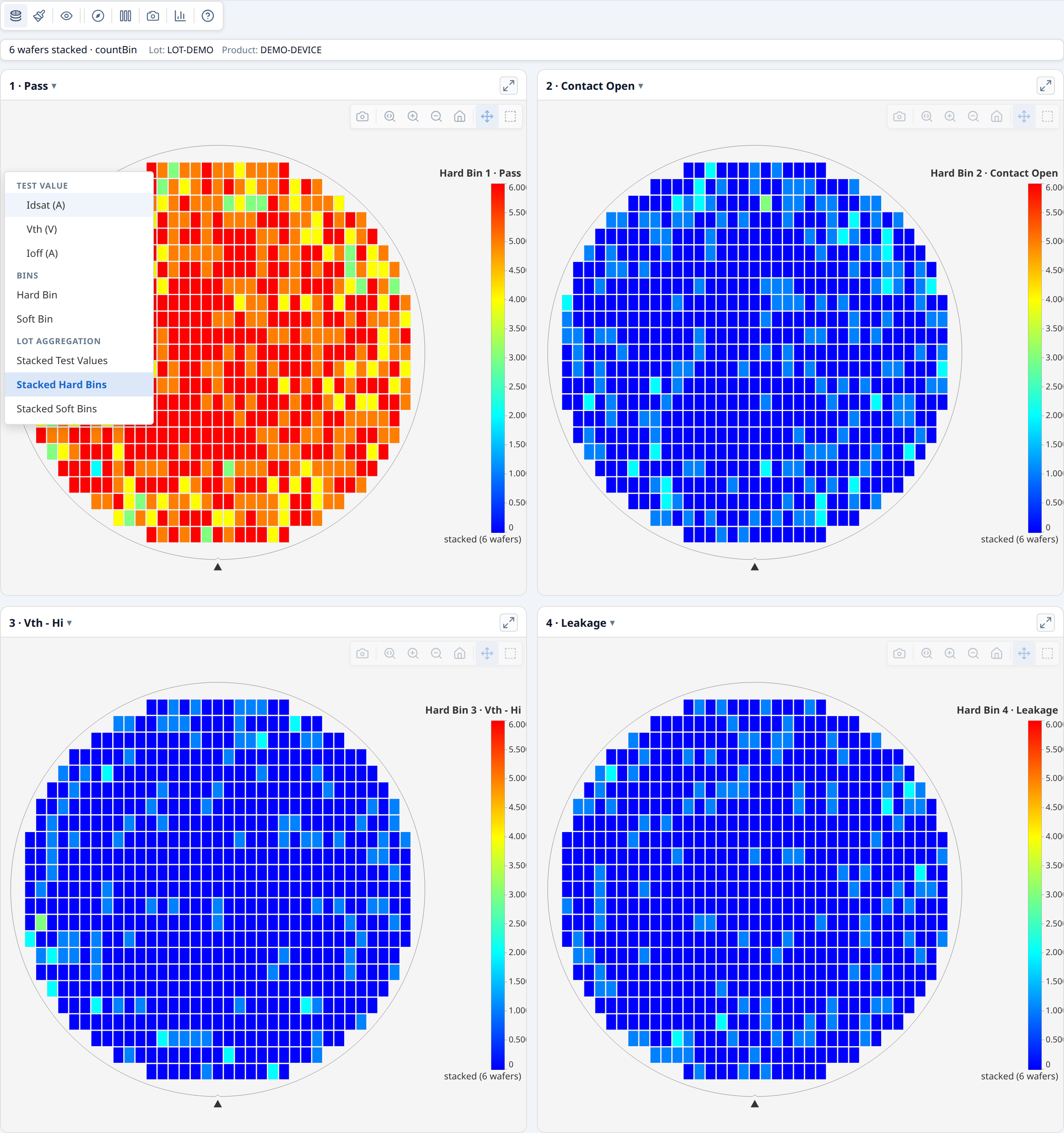
Stacked lot maps¶
The gallery toolbar includes three stacked modes that aggregate the full lot into a single view — one card per bin or per test parameter. Switch mode via the mode picker in the gallery control bar:
| Mode | What each card shows |
|---|---|
| Stacked Test Values | Per-die mean (or median, std dev, min, max) across all wafers |
| Stacked Hard Bins | Per-die count of wafers on which that hard bin appeared |
| Stacked Soft Bins | Per-die count of wafers on which that soft bin appeared |
Switching to a stacked mode rebuilds the card set automatically; switching back restores the original per-wafer cards.
Aggregation method. For Stacked Test Values the default aggregation is mean.
Change it via the Σ button in the gallery control bar (visible only in this mode),
or programmatically:
Zero-config discovery. Even without testDefs or binDefs, the gallery scans
the lot data to discover unique tests and bins when entering a stacked mode, and
generates default labels (e.g. "Test 1050", "Bin 2") automatically.
Spatial findings. Each stacked card automatically gets a spatial analysis summary — detach the card into its own window and click the findings button to see ring, quadrant, sector, and cluster findings on the aggregated map. No extra code is required.
→ Demo: Building a lot gallery
See also: Demo: Lot-level findings with stacked modes
Lot-level statistical findings¶
analyzeWaferLot detects cross-wafer patterns across a lot:
- Repeated patterns — ring, quadrant, or reticle findings that appear on ≥ 2 wafers
- Inter-wafer yield outliers — individual wafers whose yield deviates from the median of the wafers analysed. The finding calls it the "lot median" only when every wafer records the same lot ID; a set pooled from several lots, or with no lot IDs, reads "median of all wafers".
It runs per-wafer analysis internally, so a single call gives you everything — no separate analyzeWaferMap per item is needed.
import { analyzeWaferLot } from '@wafertools/wafermap/stats';

const lotSummary = analyzeWaferLot(waferResults);

const items = waferResults.map((r, i) => ({
  ...r,
  label: `Wafer ${i + 1}`,
}));

renderWaferGallery(container, items, {
  viewOptions:     { plotMode: 'hardBin' },
  lotStatsSummary: lotSummary,
});
Pass computePerTestStats: true to also populate lotSummary.perWaferTestStats — a per-wafer × per-test five-number summary (min/Q1/median/Q3/max plus mean/stddev/count) ready for box-plot rendering. Each entry corresponds to one wafer and has a tests array with the same shape as StatsSummary.stats.perTestStats. (enableTestValueAnalysis: true populates it too, but also runs the much more expensive regional Welch findings pass — prefer computePerTestStats when you only need distribution stats for box plots.)
A Summary panel button appears in the gallery control bar. Clicking it opens one panel:
yield, bin breakdown and ring/quadrant statistics across all the wafers, cross-wafer findings,
and a Wafer Yield list with each wafer badged by its own findings count — click a wafer to
detach its card into its own window with its full per-wafer findings. The header names the
population: Lot LOT123 · 13 wafers when every wafer records one lot ID, otherwise
26 wafers from 2 lots (or 13 wafers with no lot IDs).
What highlighting looks like¶
- Repeated pattern finding (ring/quadrant seen across N wafers): the affected wafer cards are outlined; the matching die zone is highlighted on each card using that wafer's own per-wafer finding data
- Yield outlier (single wafer): the outlier card is outlined
- Clicking the active finding again clears all highlights
Updating the lot summary at runtime¶
const ctrl = renderWaferGallery(container, items, { lotStatsSummary });

// After data changes:
const newLotSummary = analyzeWaferLot(newResults);
ctrl.setLotStatsSummary(newLotSummary);
→ Demo: Lot-level statistical findings

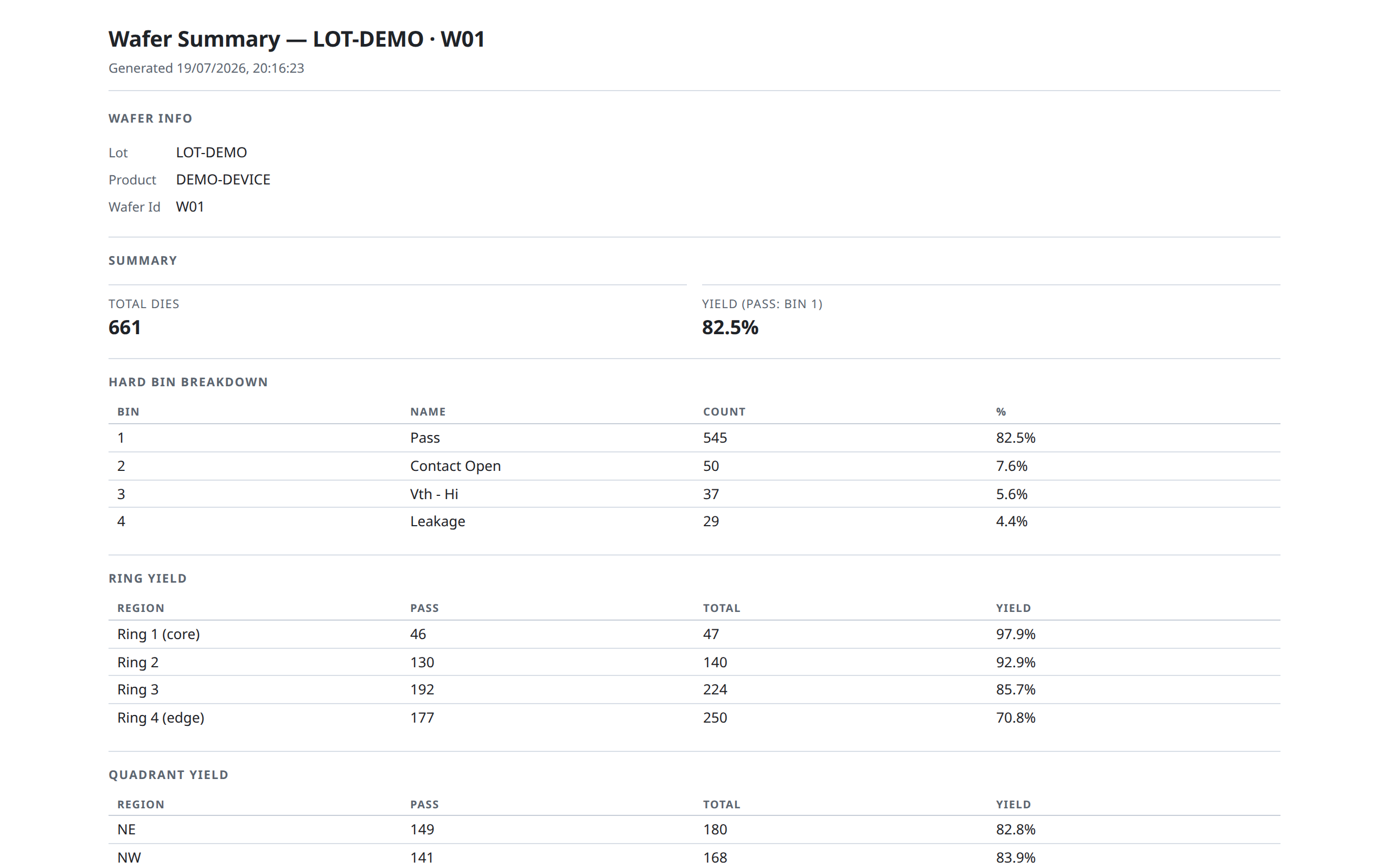
Exporting reports¶
The library can generate standalone printable HTML reports that open in a new browser tab and can be saved as PDF.
Calling the report builders directly is deprecated — removed in 0.31.0. The Summary panel's report button produces these reports;
setReportOpener, below, routes them into your host and stays.
Wafer summary report — everything shown in a single wafer's summary panel (yield, bins, ring/quadrant yield, test stats, findings):
import { renderSummaryReportHtml, openHtmlReport } from '@wafertools/wafermap/stats';

const html = renderSummaryReportHtml({
  ...result,   // wafer, dies, bin/test defs, and the passBins + ringCount the map was built with
  yieldSummary:  summary.stats,
  dataCoverage:  summary.stats.dataCoverage,
  statsSummary:  summary,
});
openHtmlReport(html);
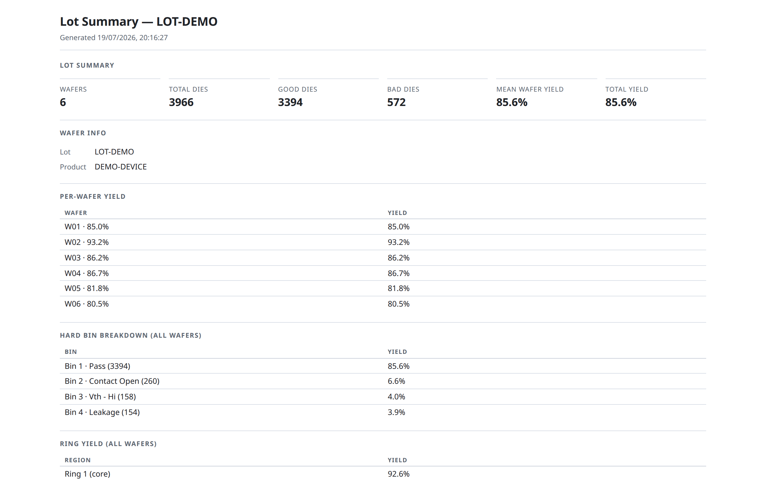
Lot summary report — the lot-level equivalent, covering per-wafer yield table, bin breakdown, ring/quadrant yield, lot-level test stats, and lot findings. Grouping, per-group analysis, and rendering all happen internally — pass the raw items list, never a pre-computed lotSummary; a mixed multi-lot/multi-product/multi-temperature load is automatically split into separate labelled sections rather than pooled:
import { renderLotSummaryReportHtml, openHtmlReport } from '@wafertools/wafermap/stats';

const html = renderLotSummaryReportHtml({
  // Each item carries its own wafer, dies and passBins from its result.
  items: waferMapResults.map((r, i) => ({ ...r, label: `W${i + 1}` })),
  hbinDefs:  waferMapResults[0].hbinDefs,
  sbinDefs:  waferMapResults[0].sbinDefs,
  testDefs:  waferMapResults[0].testDefs,
  ringCount: waferMapResults[0].ringCount,
});
openHtmlReport(html);
Findings-only report — a lighter report with just the severity-coded findings table, works for both wafer and lot summaries:
import { renderFindingsReportHtml, openHtmlReport } from '@wafertools/wafermap/stats';

openHtmlReport(renderFindingsReportHtml(lotSummary));
The summary panel's "Summary report" button in renderWaferMap and renderWaferGallery calls the appropriate function automatically — you only need to call these directly when building a custom export flow.
Embedded hosts (Tauri, Electron, WebView2). In hosts where window.open is blocked, register a custom opener once at startup:
import { setReportOpener } from '@wafertools/wafermap/stats';

setReportOpener(html => {
  // route to a host-managed window, IPC call, etc.
  myApp.showReport(html);
});
All openHtmlReport calls — including the summary panel buttons — then route through your opener automatically.
The Insights tab¶
renderWaferMap and renderWaferGallery both support an opt-in Insights tab — a chart suite covering per-test pass rates, process capability, value distributions, wafer-to-wafer drift, and test correlation, computed from the same dies already on screen. Enable it with one option; there's no per-chart wiring and no host-computed grouping to set up.
Either way, an Insights button appears in the toolbar. Clicking it swaps the map (or gallery grid) for the chart suite; clicking it again — the toolbar stays visible and usable throughout — returns to the map. Pass defaultOpen: true to land on the charts instead of the map, for a surface where the analysis is the point rather than an option — the Insights example does exactly that. Panels read parametric test values, so pass testDefs to buildWaferMap if you want the pass-rate chart, capability, box plots, histograms, the trend chart, correlation, and scatter to have data; yield and bin pareto only need die.hbin/die.sbin.
The toolbar itself adapts: mode, palette, overlay, orientation, Expand, and Findings controls (and, in a gallery, columns/download) are hidden while the Insights tab is open — none of them apply to the chart suite, and Findings specifically toggles the map/gallery findings panel, which sits behind (or inside the now-hidden grid body of) the Insights view with no visible effect. Only Insights and User guide stay visible. Expand has no single view left to enlarge once Insights owns the screen — each chart panel inside Insights has its own expand button instead, for enlarging just that chart.
The tab lays out three sub-tabs:
- Overview — headline tiles naming the population (wafers, dies analysed and excluded, and for a lot the mean wafer yield), a per-test pass rate chart (worst test first, one sub-bar per group when grouping is active), a yield bar labelled with the actual pass bins in use and marked with a dashed median reference, and a hard/soft bin pareto.
- Distributions — process capability, a test-value box plot, a value histogram, and a wafer-to-wafer trend (one point per wafer at its mean, ±1σ whiskers, the die-weighted lot mean as a centre line, and spec limits where the test has them). The trend is always in slot order and has no sort control by design — drift only reads in the population's own sequence.
- Correlation — a Pearson-r matrix (each cell carrying its own
n) and a die-level X/Y scatter that printsrandnfor the pair it is showing.
Clicking a capability box drives the box plot, histogram and trend's selected test in place; clicking a correlation-matrix cell drives the scatter panel's X/Y in place — the same live cross-linking the toolbar's own mode/colour controls give you elsewhere.
Grouping (gallery only)¶
With more than one wafer, a Group by control appears above the panels whenever wafer metadata actually varies on a groupable field (lot, product, testProgram, temperature, split, or a custom key) — nothing to configure, it's derived from wafer.metadata the same way renderWaferGallery already reads it elsewhere:
renderWaferGallery(container, items, {
  insights: { enabled: true },
  lotStatsSummary: analyzeWaferLot(items),
});
Passing lotStatsSummary (see Lot-level statistical findings) also makes the yield panel reuse each wafer's already-computed yield instead of recomputing it — so the Insights tab's numbers always agree with the gallery's own Summary panel and any exported report. Each panel consumes an active grouping in whatever way suits that chart type: yield/bin-pareto/box-plot pool one row per group with click-to-drill; histogram overlays one series per group; capability and correlation restrict to one group at a time via their own "Group:" dropdown (pooling either would be statistically misleading); scatter never restricts, colouring every group's points instead. Full behavior for each panel is in the API reference.
For a single wafer, or a gallery where nothing varies, there's simply no "Group by" control to show — every panel already displays that population directly.
Narrowing to one wafer¶
Histogram, correlation, and scatter each draw one shared chart rather than one per wafer, so when ungrouped they pool every wafer by default. A "Wafer: All wafers ▾" picker on each of those three panels lets you narrow to a single wafer instead — useful when correlation or scatter's "Mixed <field>" warning appears (comparing wafers that differ on a groupable field can be misleading, the same Simpson's-paradox concern grouping addresses at the lot level).
Opening a wafer from a chart¶
Clicking a leaf row in the yield bar or the box plot — or a point on the trend chart — opens that wafer in a modal. A box-plot click is context-aware: it opens the wafer already in test-value mode on the test you were looking at, not the toolbar's default plot mode — so drilling from "Idsat" in the box plot lands you on the Idsat colour map, not a hard-bin view you'd have to switch away from.
→ Demo: Your first wafer map and Demo: Building a lot gallery both have the Insights tab enabled — click the toolbar's Insights button in either to try it.
Reticle overlays¶
A reticle (stepper field) is a rectangular group of dies that the lithography tool exposes in a single step. The reticle overlay draws the field boundaries on top of the wafer map and enables reticle-position analysis in the stats engine.
Adding a reticle overlay¶
const result = buildWaferMap({
  results,
  dieConfig:     { width: 10, height: 10 },
  reticleConfig: {
    width:  4,    // 4 dies wide per stepper field
    height: 2,    // 2 dies tall per stepper field
    // anchorDie: { x: 1, y: 0 }  // optional: pin a specific die (die.x/die.y) to a
                                    // field's min-x/min-y corner (bottom-left, since +Y is up)
  },
});

renderWaferMap(container, result);
// showReticle defaults to true when result.reticles is non-empty
The toolbar shows a Reticle toggle button whenever reticles is non-empty.
Once a reticleConfig is set, every die's hover tooltip also gains a
Reticle (column, row) line directly below Die (x, y), showing that die's
field-local position (0-indexed, relative to anchorDie) — independent of
whether the reticle overlay is currently toggled on. This is on by default
with no extra configuration.
Reticle analysis in the stats engine¶
When a reticleConfig was used, analyzeWaferMap automatically includes
reticle-position comparisons (die's position within its stepper field vs. rest of reticle).
This surfaces systematic problems from mask defects, focus variation, or lens
aberrations:
const result  = buildWaferMap({ results, dieConfig, reticleConfig });
const summary = analyzeWaferMap(result);
// result.reticleConfig is passed through automatically
Reticle overlay in a gallery¶
Spread the result directly — r.reticles is already part of WaferMapResult.
The gallery enables the Reticle toggle button automatically when any item has reticles:
const items = waferResults.map(r => ({ ...r }));
// or with a label:
const items = waferResults.map((r, i) => ({ ...r, label: `W${i + 1}` }));
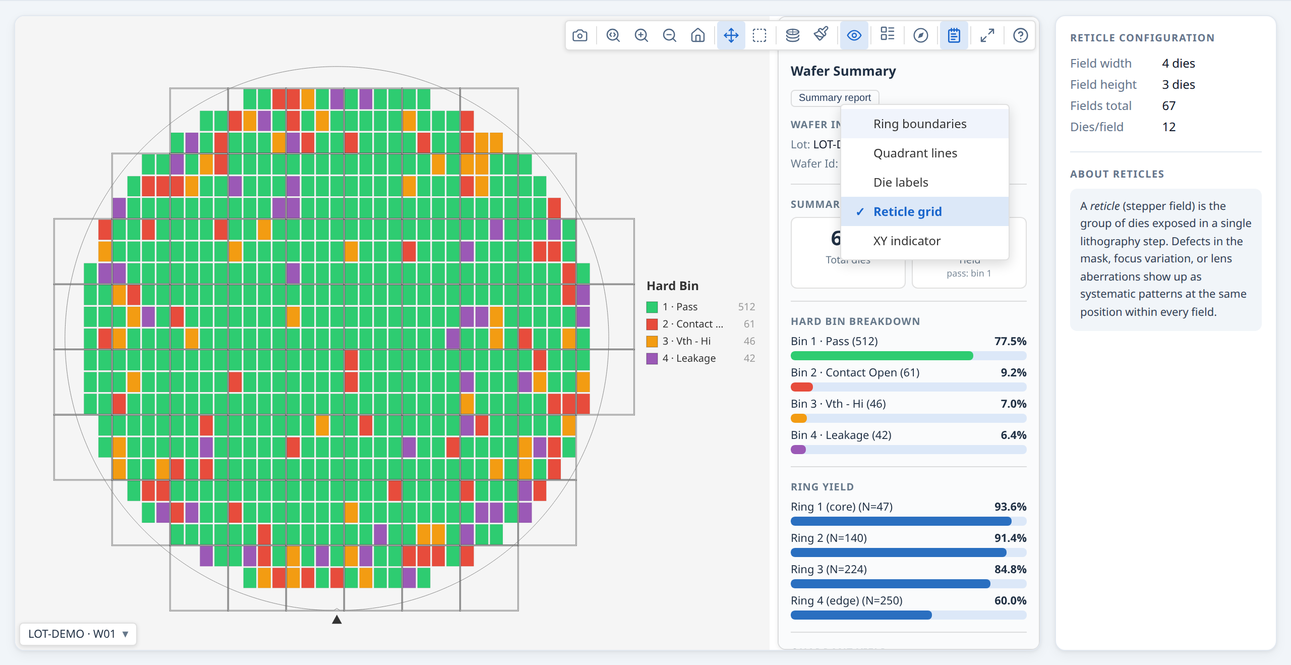
Multi-site parallel testing¶
Modern probers test multiple dies simultaneously using a multi-site probe card. Each
site on the card contacts a different die, and the tester records which site produced
each result via the STDF site_num field. Supplying siteNum on each DieResult
enables per-site analysis in the stats engine: the engine compares yield and bin
distributions across sites, surfacing systematic probe card or prober alignment
problems.
Supplying site numbers¶
Pass siteNum on each die result — it maps directly from the STDF site_num field:
const results = stdfRows.map(row => ({
  x:       row.x_coord,
  y:       row.y_coord,
  hbin:    row.hard_bin,
  siteNum: row.site_num,   // STDF site_num — which parallel site tested this die
}));

const result = buildWaferMap({ results, passBins: [1] });
Test-site analysis in the stats engine¶
analyzeWaferMap enables test-site analysis automatically when the data contains
meaningful site duplication — at least two distinct siteNum values each appearing
on three or more dies (the guard that distinguishes a 4-site probe card from a
monotonically-incrementing counter):
const summary = analyzeWaferMap(result);
// test-site findings appear automatically when the guard passes
Findings compare each site against all other sites, using the same yield, hard-bin, soft-bin, and test-value analyses as spatial regions. A finding such as:
points directly to a probe card contact problem on that site.
Prober step identifier¶
The STDF pir.part_id field records the tester's identifier for each tested unit —
at most fabs this encodes probe sequence (the order in which the prober stepped across
the wafer). Supply it as partId to preserve it through the library for traceability
or custom sequential analysis:
const results = stdfRows.map(row => ({
  x:      row.x_coord,
  y:      row.y_coord,
  hbin:   row.hard_bin,
  siteNum: row.site_num,
  partId:  row.part_id,   // STDF pir.part_id — 1-based tester step identifier
}));
partId is carried through to every Die and appears in hover tooltips alongside
x, y, and bin assignments. The field is semantically neutral — its exact meaning
is fab-specific — so the library stores it as-is without interpretation.
→ Demo: Multi-site parallel testing
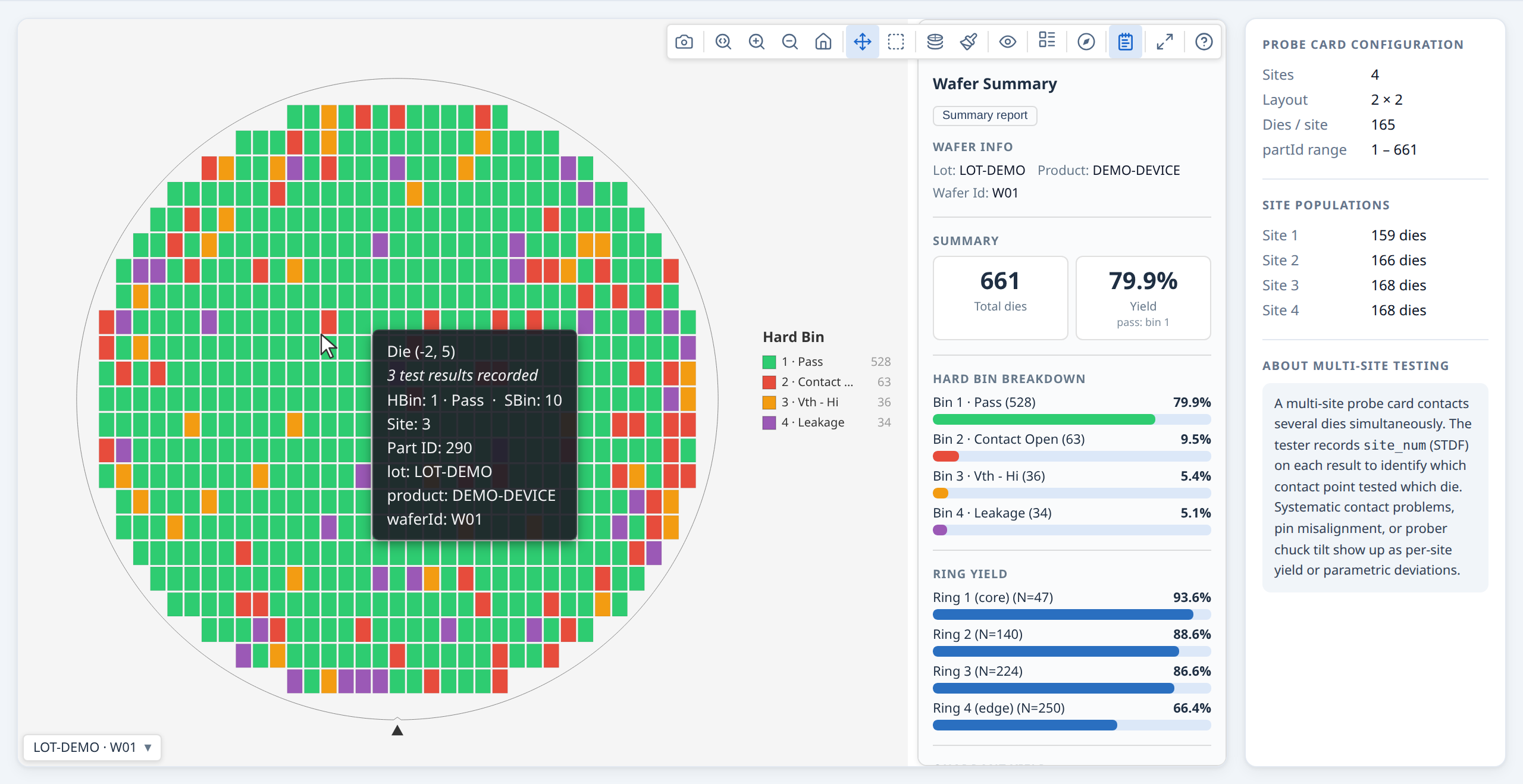
Processing large datasets with a Web Worker¶
For lots with many wafers or high die counts, buildWaferMap can be moved off the
main thread to avoid blocking the UI.
Use the worker for responsiveness, not speed. The worker runs the same code as the main thread, then pays extra to copy the input in and the result out across
postMessage(structured clone). In total wall-clock time it is always slower than callingbuildWaferMapdirectly — what you gain is that the page stays interactive instead of freezing during a big build. Only reach for it when a single synchronous build is large enough to cause a visible freeze (roughly tens of thousands of dies). Below a few thousand dies it just adds latency; build on the main thread. See §8 in the API reference for indicative timings and the crossover point.
Setup¶
import { createWafermapWorker } from '@wafertools/wafermap/worker';

// Vite / webpack — import the pre-built worker script
import workerUrl from '@wafertools/wafermap/worker-script?url';
const wmWorker = createWafermapWorker(new Worker(workerUrl, { type: 'module' }));

// Plain HTML / CDN
const wmWorker = createWafermapWorker(
  new Worker('https://cdn.jsdelivr.net/npm/@wafertools/wafermap/dist/packages/worker/wafermap.worker.js', { type: 'module' })
);
Create the worker once at app startup and reuse it for all calls.
Replacing buildWaferMap with worker.run¶
// Before:
const result = buildWaferMap({ results, waferConfig, dieConfig });

// After (same input/output, just async):
const result = await wmWorker.run({ results, waferConfig, dieConfig });

// Everything after is unchanged:
renderWaferMap(container, result);
Processing a lot in parallel¶
const waferResults = await Promise.all(
  waferIds.map(id => wmWorker.run({
    results:     dataByWafer[id],
    waferConfig: { diameter: 300 },
    dieConfig:   { width: 10, height: 10 },
  }))
);
If you also need the analysis summaries, use runWithAnalysis instead of run
followed by runAnalysis — it builds and analyses in one round-trip so the large
result objects are not cloned back into the worker just to be analysed:
const { results, waferSummaries, lotSummary } = await wmWorker.runWithAnalysis(
  waferIds.map(id => ({ results: dataByWafer[id], dieConfig: { width: 10, height: 10 }, passBins: [1] })),
  {},
  waferIds.length > 1,
);
Cleanup¶
Note:
renderWaferMapandrenderWaferGalleryrequire the DOM and must run on the main thread.analyzeWaferMap/analyzeWaferLotandbuildWaferMapare pure functions with no DOM access — they can run in a Web Worker, Node.js, or any server-side environment.
→ Demo: Processing large datasets with a Web Worker
Custom colour schemes¶
Bin maps and value maps have separate colour schemes, each its own view option and its own registry, so a user can keep Mako for values and the colour-blind-safe palette for bins without either resetting the other on a mode switch:
binColorScheme—'default'or'accessible'(colour-blind safe). Used by Hard Bin and Soft Bin maps.valueColorScheme—'default'(Viridis),'cividis'(colour-blind safe),'greyscale','plasma','inferno','mako','traffic'(green→yellow→red, low=good) and'jet'(the MATLAB rainbow). Used by Test Value maps and all three stacked modes — a stacked-bin map is a value map, showing how often a bin occurs at each position.reverseValueScheme— flips whichever gradient is selected, offered in the menu as Reverse gradient. One flag rather than a reversed twin of every ramp, so it works on a gradient you registered yourself too.
Every built-in but 'traffic' and 'jet' reads low = dark, high = light — the direction
matplotlib and seaborn define these ramps with. It is worth knowing why, because it is easy to
assume the opposite is friendlier: on a stacked map the healthy bulk of the wafer (fail count 0)
sits back as dark ground and an edge ring or a scratch lights up. Reversed, the defects become
dark specks on a glowing field, which is the harder read. Set reverseValueScheme when your
parameter genuinely has its notable end at the bottom.
How bin colours are assigned¶
A bin's colour comes from its number and whether it passes, never from how many dies it has, so bin 7 is the same colour in every lot, gallery and screenshot of a program. One rule (which every surface uses — map, legend, summary panel, Insights charts) applies it:
- Pass bins are green, fail bins are not. Which bins pass comes from
passBins, so a failing bin 1 is never green and a passing bin 3 always is. A soft bin counts as passing when every die carrying it passes. - The bin number picks the colour. Bin 1 takes the palette's first pass colour and bin 2 its first fail colour, then on through each list, wrapping round. The front of each list is the most distinct, so the low bin numbers most programs use get the clearest colours.
- Hard and soft bins are coloured separately. Soft bins start half a palette further on, so hard bin 3 and soft bin 3 are different colours.
- Bins a palette-length apart share a colour (fail bins 2 and 21 in the default palette).
When both are on screen the map raises a
bin-colors-sharedwarning naming them rather than letting two bins look identical. - Colours from bin definitions win. A
BinDef.color(a site's standard bin colour sheet, say) overrides the palette for that bin; the viewer can switch that off with Use colours from bin definitions in the Palette menu, and back on again.
Registering your own¶
import { registerBinColorScheme, registerValueColorScheme } from '@wafertools/wafermap';

registerBinColorScheme('my-brand', {
  label: 'My Brand',
  pass: ['#1b7f3b', '#7cc68a'],                         // passing bins, from bin 1
  fail: ['#c62828', '#1565c0', '#ef6c00', '#6a1b9a'],   // failing bins, from bin 2 — most distinct first, no greens
});

registerValueColorScheme('my-brand', {
  label: 'My Brand',
  forValue: (t: number) => `rgb(0,${Math.round(t * 100)},${Math.round(80 + t * 175)})`,  // t ∈ [0, 1]
});

// Each now appears in the matching toolbar Palette menu automatically. Apply programmatically:
ctrl.setOptions({ binColorScheme: 'my-brand', valueColorScheme: 'my-brand' });
Register your schemes once, before any renderWaferMap call.
They are global and persist for the lifetime of the page. Both choices are WaferPreferences,
so onViewOptionsChange reports a change to either with category 'preference' — save them
there and pass them back in viewOptions to remember a user's choice.
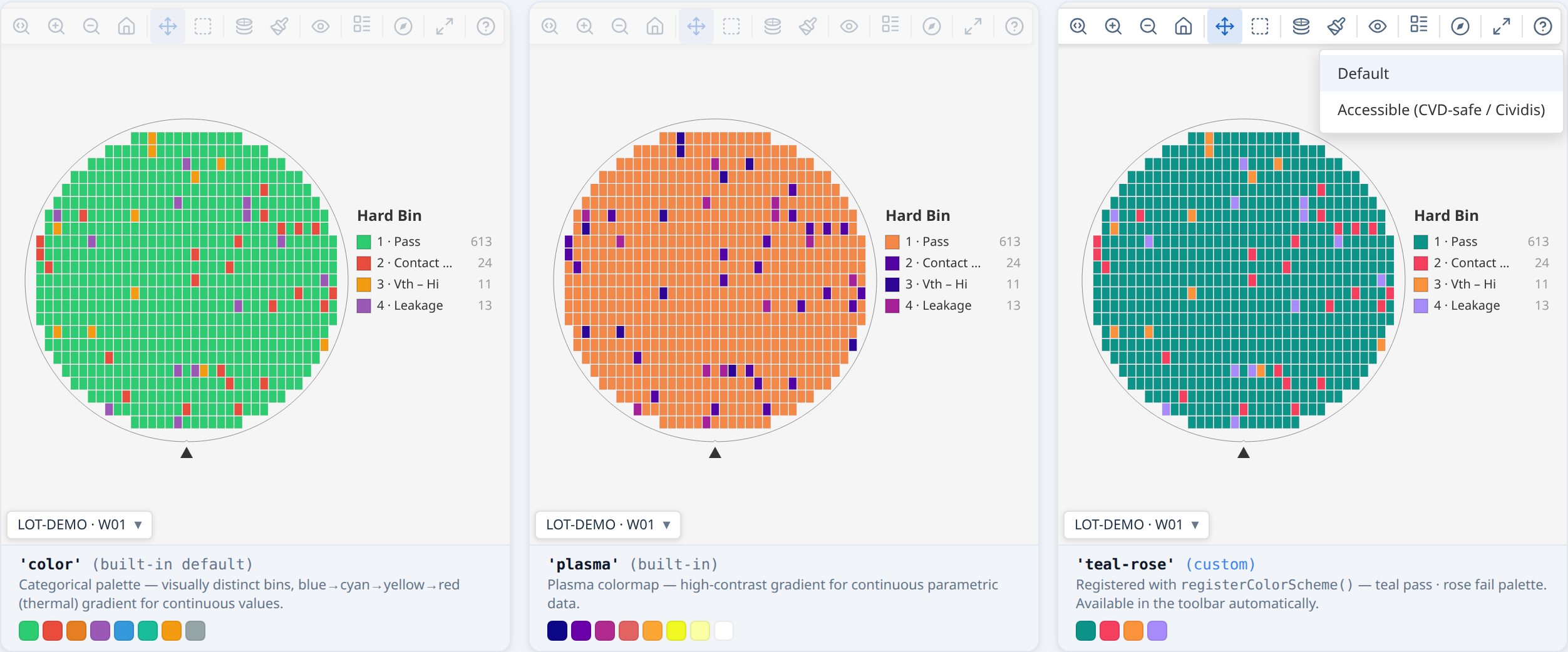
Recipes¶
Short, task-focused examples for common integration questions.
Render a static thumbnail (no toolbar)¶
Pass showToolbar: false for embedded widgets, report thumbnails, or any context
where the interactive toolbar would be intrusive:
The map still renders at full quality with tooltips disabled. To re-enable
tooltips while keeping the toolbar hidden, pair with showTooltip: true.
Build a gallery from a CSV grouped by wafer ID¶
The typical first integration: parse a multi-wafer CSV, group rows by wafer, and render them all as a gallery.
import { buildWaferMap } from '@wafertools/wafermap';
import { renderWaferGallery } from '@wafertools/wafermap/render';

// 1. Parse — cast all numeric fields; CSV parsers return strings
const rows = csvText.trim().split('\n').slice(1).map(line => {
  const [lot, wafer, x, y, hbin, sbin, testA, testB] = line.split(',');
  return { wafer, x: +x, y: +y, hbin: +hbin, sbin: +sbin,
           testValues: { 1010: +testA, 1020: +testB } };
});

// 2. Group by wafer ID — build results as items in one pass
const byWafer = Map.groupBy(rows, r => r.wafer);  // Node 21+ / modern browsers
// or: rows.reduce((m, r) => (m.set(r.wafer, [...(m.get(r.wafer) ?? []), r]), m), new Map())

const items = [...byWafer.entries()].map(([waferId, waferRows]) => ({
  ...buildWaferMap({ results: waferRows, passBins: [1] }),
  label: waferId,
}));

// 3. Render — one call, shared toolbar across all cards
renderWaferGallery(document.getElementById('gallery'), items);
Re-use a single result for both rendering and analysis¶
analyzeWaferMap accepts a WaferMapResult directly — no need to call
buildWaferMap twice:
const result  = buildWaferMap({ results, passBins: [1] });
const summary = analyzeWaferMap(result);

// summary panel and findings button appear automatically
renderWaferMap(container, result, { statsSummary: summary });
Fit multiple maps to the same value range¶
When showing several wafers side-by-side in value mode, lock them all to the same colour scale so differences in the data are visible rather than hidden by per-wafer auto-scaling:
const TEST = 1050;  // the test we lock the scale to

// Compute the shared range across all wafers first
let min = Infinity, max = -Infinity;
for (const r of waferResults) {
  for (const die of r.dies) {
    const v = die.testValues?.[TEST];
    if (v !== undefined) { min = Math.min(min, v); max = Math.max(max, v); }
  }
}

// Apply it as a per-card override so the shared gallery scale doesn't override it.
// Use the test-keyed `{ test, range }` form: the range is bound to the test it was
// computed from. If the active test is ever something other than TEST, the library
// ignores the range and auto-scales rather than colouring the wrong test's data
// against 1050's scale — you cannot accidentally produce a mis-scaled plot.
const items = waferResults.map((r, i) => ({
  ...r,
  label: waferIds[i],
  viewOptions: { valueRange: { test: TEST, range: [min, max] }, activeTest: TEST },
}));

renderWaferGallery(container, items, { viewOptions: { plotMode: 'value' } });
The plain tuple form
valueRange: [min, max]still works and applies to whichever test is active — but then keeping it consistent withactiveTestis your responsibility. Prefer{ test, range }whenever the range was derived from a specific test.
Changing the ring count¶
Set ringCount once, on buildWaferMap (default 4). The result carries it, and the ring
boundaries on the map, the Summary panel's ring yield, the report and the ring findings all
read it, so "Ring 2" always names the same dies:
const result  = buildWaferMap({ results, waferConfig, dieConfig, ringCount: 5 });
const summary = analyzeWaferMap(result);
renderWaferMap(container, result, { statsSummary: summary });
Sync toolbar state to your own UI controls¶
onViewOptionsChange fires whenever the toolbar changes a display option. Use
it to reflect the map's current state in external controls — a mode dropdown, a
rotation indicator, or a URL query string:
const ctrl = renderWaferMap(container, result, {
  viewOptions: { plotMode: 'hardBin' },
  onViewOptionsChange: (opts, changed, category) => {
    modeDropdown.value = opts.plotMode;
    if (category !== 'state') {
      urlParams.set('mode', opts.plotMode);
      history.replaceState(null, '', '?' + urlParams);
    }
  },
});

// Drive the map from external controls in the other direction:
modeDropdown.addEventListener('change', () => {
  ctrl.setOptions({ plotMode: modeDropdown.value });
});
Use gross die yield (edge dies in denominator)¶
By default, edge-excluded dies are removed from both the numerator and
denominator — they don't affect yield either way. Set
edgeDieYieldMode: 'denominator-only' to compute gross die yield instead —
edge dies count against yield but can never pass:
const result = buildWaferMap({
  results,
  waferConfig: { diameter: 300, edgeExclusion: 3 },
  dieConfig:   { width: 8, height: 12 },
  passBins:    [1],
  edgeDieYieldMode: 'denominator-only',
});

const { yieldPercent, yieldPercentGross } = result.yield;
// yieldPercent      — standard yield: edge dies excluded from both sides
// yieldPercentGross — gross die yield: edge dies in denominator only
Filter findings by severity, kind, or spatial family¶
filterFindings slices the findings array from any StatsSummary or
LotStatsSummary. All criteria are ANDed; each accepts a single value or an
array:
import { filterFindings } from '@wafertools/wafermap/stats';

// Only ring or quadrant findings at unusual severity:
const critical = filterFindings(summary, {
  severity: 'unusual',
  family:   ['ring', 'quadrant'],
});

// All yield findings regardless of severity:
const yieldFindings = filterFindings(summary, { kind: 'yield' });
Analyse a lot in Node.js without a browser¶
buildWaferMap and analyzeWaferMap have no DOM dependency — run them in a
plain Node.js script for CI checks, batch processing, or quick dataset
exploration:
// analyse-lot.mjs  —  node analyse-lot.mjs
import { readFileSync } from 'node:fs';
import { buildWaferMap }   from '@wafertools/wafermap';
import { analyzeWaferMap } from '@wafertools/wafermap/stats';

const csv    = readFileSync('data/wafers.csv', 'utf8');
const lines  = csv.trim().split('\n');
const header = lines[0].split(',');
const col    = (row, name) => row[header.indexOf(name)];

const rows = lines.slice(1).map(line => {
  const r = line.split(',');
  return { wafer: col(r,'wafer'), x: +col(r,'x'), y: +col(r,'y'),
           hbin: +col(r,'hbin'), testValues: { 1010: +col(r,'testA') } };
});

const byWafer = Map.groupBy(rows, r => r.wafer);

for (const [waferId, waferRows] of byWafer) {
  const result  = buildWaferMap({ results: waferRows, passBins: [1] });
  const summary = analyzeWaferMap(result);
  const yld     = summary.stats.yieldPercent;
  const top     = summary.findings[0];
  console.log(
    `${waferId}  yield=${yld !== null ? yld.toFixed(1) + '%' : 'n/a'}` +
    `  findings=${summary.findings.length}` +
    (top ? `  top=[${top.severity}] ${top.summary}` : ''),
  );
}
Keep a gallery responsive when building many maps¶
buildWaferMap and analyzeWaferMap are synchronous. Building a large gallery in
a single .map() loop blocks the main thread until all items are ready, leaving
the page blank for several seconds.
Pass factory functions instead of pre-built items and the gallery handles the rest — the control bar and placeholder cards appear immediately, and each card is built and inserted one per browser task as the factories run:
const items = fixtures.map(sample => () => {
  const result  = buildWaferMap({ results: sample.results, passBins: [1] });
  const summary = analyzeWaferMap(result);
  return { ...result, label: sample.label, statsSummary: summary };
});

renderWaferGallery(container, items);
The only visible difference is that each card's label is blank until its factory runs — if the label depends on computed data (e.g. a findings count), it appears when the card does rather than upfront. If the label is known in advance and you want it visible immediately, pre-build items as usual for those cards.
Standalone stacked lot map with programmatic findings access¶
The gallery's stacked modes cover most use cases. Use buildWaferMap({ lotStack })
directly when you need one or more of:
- A standalone stacked map outside a gallery (e.g. a dedicated lot-average view)
- Programmatic access to findings before rendering (to filter, store, or feed your own UI)
- A fixed aggregation method set at build time rather than chosen interactively
import { buildWaferMap } from '@wafertools/wafermap';
import { renderWaferMap } from '@wafertools/wafermap/render';
import { analyzeWaferMap } from '@wafertools/wafermap/stats';

// Aggregate six wafers into a single mean map
const result = buildWaferMap({
  lotStack:    { results: waferResults, method: 'mean' },
  waferConfig, dieConfig,
  testDefs,    // include limitLow/limitHigh to enable cluster detection
});

// Run spatial analysis on the aggregated result
const summary = analyzeWaferMap(result, {
  testNumbers: [1060],   // optional: restrict to a specific test
});

// summary.stats.isLotStack        === true
// summary.stats.aggregationMethod === 'mean'

renderWaferMap(container, result, {
  viewOptions:  { plotMode: 'value', activeTest: 1060 },
  statsSummary: summary,
  summaryPanel: { defaultOpen: true },
});
Systematic lot patterns (e.g. an NE-quadrant drift present on every wafer) survive averaging and emerge as clear findings on the lot-average map. The Summary panel labels the view as "N wafers · mean" so it is unambiguous to the reader.
For cluster and edge-arc detection, dies that exceed a test's spec limits
(limitLow / limitHigh in testDefs) are used as the failure proxy. If no spec
limits are defined, cluster detection is skipped automatically.
→ Demo: Standalone stacked map with spatial analysis
Advanced: the rendering pipeline¶
Deprecated — removed in 0.31.0. The manual pipeline (
createWafer,generateDies,clipDiesToWafer,applyOrientation,applyProbeSequence,transformDies,generateReticleGrid,buildView,toCanvasand their helpers) is being withdrawn. Nothing known uses it, and it doubled the API a host had to read. Build withbuildWaferMapand draw withrenderWaferMaporrenderWaferGallery, which handle geometry, orientation, probe paths, reticles and interaction. If you depend on the pipeline, say so at https://github.com/wafertools/wafermap/issues.
Metadata / layout plot mode¶
Sometimes a grid position represents a classification rather than a test result —
which project a die belongs to on a multiproject wafer, vendor/third-party
ownership, or reserved/shared area. Mapping that onto hard bins borrows
pass/fail-flavoured colours and "Hard Bin" terminology for data that isn't a bin
at all. The 'metadata' plot mode is a generic alternative: it colours and
legends the map from whatever key you already have in die.metadata, no new
per-die field required.
Opting a field in¶
A key is only offered in the toolbar's mode menu once it's listed in
metadataFields — never auto-detected:
const result = buildWaferMap({
  results: [
    { x: 4, y: -2, hbin: 1, metadata: { project: 'our-project' } },
    { x: 5, y: -2, metadata: { project: 'vendor' } }, // vendor die — no test data at all
  ],
  metadataFields: [
    { key: 'project', label: 'Project', values: [
      { value: 'our-project', color: '#4e79a7' },
      { value: 'vendor',      label: 'Third-party vendor', color: '#bab0ac' },
    ] },
  ],
});

renderWaferMap(container, result, {
  viewOptions: { plotMode: 'metadata', activeMetadataKey: 'project' },
});
values is optional per field — distinct values with no override are still
shown, auto-labelled with the raw value and auto-coloured from an ordered
palette (assigned in natural alphanumeric order — D0, D1, D2, D10, not the
lexicographic D0, D1, D10, D2 — so colours are stable across reloads and the
legend reads in the order an engineer expects).
Coexists with test/bin data¶
A die can carry hbin/testValues and a metadata classification at the same
time — 'metadata' is just another selectable toolbar view of the same die,
the way hardBin/softBin/value already are. die.metadata already renders
in every tooltip regardless of plot mode, so switching into 'metadata' mode
changes the map's colour/legend without changing what the tooltip shows.
Click-to-highlight in the legend¶
Clicking a legend swatch dims every other value, exactly like hardBin/
softBin — click the same swatch again to clear it. This is
highlightMetadataValue, the string-keyed analogue of highlightBin:
renderWaferMap(container, result, {
  viewOptions: { plotMode: 'metadata', activeMetadataKey: 'project', highlightMetadataValue: 'vendor' },
});
What's deliberately absent¶
- No lot-stacking. A die's layout classification is a constant of the
design, not a per-wafer measurement — there's nothing meaningful to
aggregate across a lot, so
'metadata'has nostackedXcounterpart. - No colour-scheme picker. The palette control is hidden in this mode —
colouring always uses the dedicated ordered palette plus
values[].coloroverrides, never the built-in schemes. - Never affects yield.
die.metadatawas never part of the yield-eligibility pipeline, so a die's yield/pass-fail status (if it has one) is entirely unaffected by its metadata classification.
Selection, zoom, and PNG export need no special handling — none of them are plot-mode-aware.