Quick Start — @wafertools/wafermap
For: developers integrating the library. No wafermap knowledge assumed. Next: Developer Guide.
@wafertools/wafermap renders interactive wafer maps from semiconductor die test data — colour-coded by bin or parametric value, with a built-in toolbar, tooltips, and zoom.
Not sure you need to integrate? tsmap is a finished, free application built on this library — desktop and browser, opening STDF, ATDF, CSV, JSON and Parquet with no code. If your goal is to look at wafer data rather than put wafer maps inside your own app, start there.
Install
Prefer to poke at something working first? Download the examples package — every example plus the bundled library and a minimal starter app. Unzip it, run sh serve.sh (or serve.cmd on Windows), and edit the pages in place. It works fully offline, which is often the deciding factor on a locked-down fab network.
Minimal example
Copy this into an HTML file and open it in a browser. No bundler required.
<!doctype html>
<html lang="en">
<head>
  <meta charset="utf-8">
  <title>My first wafer map</title>
</head>
<body>
  <!-- A wafer is a circular silicon substrate; dies (individual chips) are arranged in a grid across it. -->
  <!-- Give the container a fixed size — the canvas fills it automatically. -->
  <div id="map" style="width:600px; height:600px;"></div>

  <script type="module">
    import { buildWaferMap }  from 'https://esm.sh/@wafertools/wafermap';
    import { renderWaferMap } from 'https://esm.sh/@wafertools/wafermap/render';

    // x, y are integer die grid positions output by the prober — NOT millimetres.
    // hbin is the hard bin: the pass/fail category assigned by the test equipment.
    //
    // Build a synthetic lot with ~640 dies and an edge-ring failure pattern.
    // In production you would load these rows from a CSV or your test data API.
    const results = [];
    for (let x = -14; x <= 14; x++) {
      for (let y = -14; y <= 14; y++) {
        const r = Math.sqrt(x * x + y * y);
        if (r > 14.3) continue;                        // outside wafer boundary
        const h = ((Math.imul(x + 100, 2654435761) ^ Math.imul(y + 100, 2246822519)) >>> 0);
        const edgeFail = r > 11 && (h % 100) < 55;    // edge-ring yield loss
        results.push({ x, y, hbin: edgeFail ? 2 : 1 });
      }
    }
    // results is now an array of objects like:
    //   { x:  0, y:  0, hbin: 1 }   // centre die — pass
    //   { x:  4, y:  3, hbin: 1 }   // mid-wafer  — pass
    //   { x: -14, y:  1, hbin: 2 }  // outer ring — fail

    // buildWaferMap processes die data into a wafer model. Pure function — no DOM access.
    // passBins tells the library which bin numbers count as passing yield.
    const result = buildWaferMap({ results, passBins: [1] });

    // renderWaferMap mounts an interactive canvas into the container div.
    renderWaferMap(document.getElementById('map'), result);
  </script>
</body>
</html>
Open this example in your browser →
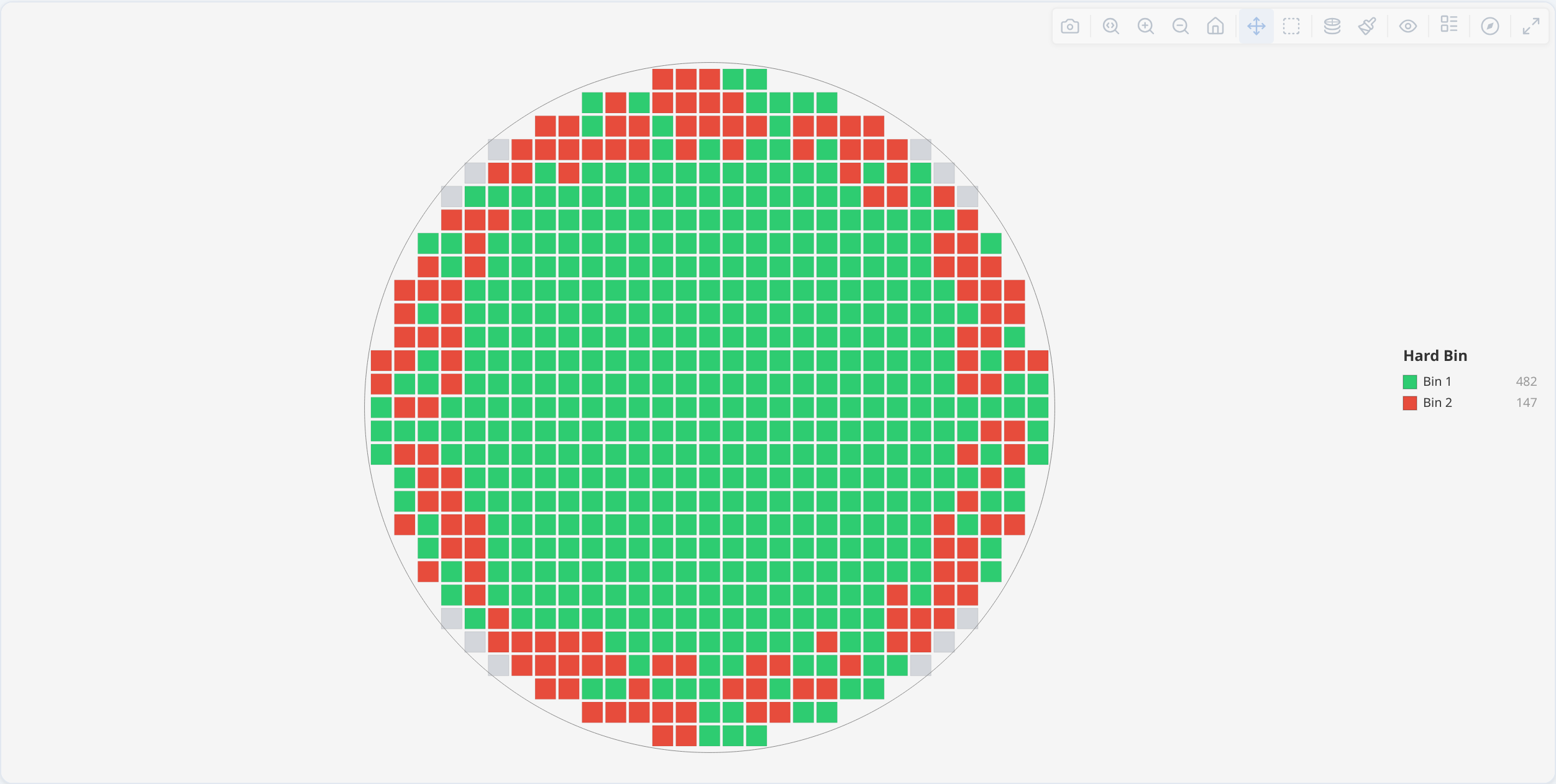
What you just built
The canvas shows your dies colour-coded by bin (green = pass, red = fail by default). The toolbar (top-right) is always shown — use it to switch plot mode, change colour scheme, rotate or flip the wafer, toggle die labels, zoom in, or download a PNG. Hover over any individual die to see a tooltip with its coordinates and bin.
You have now rendered and interacted with a real wafer map, in about twenty lines and with no build step.
Before you point this at your own data. The example passes nothing but die positions, so the library infers the wafer diameter and centre from the extent of the data. That is correct for a full or sparse wafer, but not for partial data — a contiguous region stopping short of the edge, such as a half wafer or one quadrant — where you must supply the true diameter and centre. The library flags the case it can detect with a
'partial-coverage'warning inresult.warnings. See Partial data — anchoring the wafer centre for how to set it.
Next steps
- Load real CSV data → Guide: Loading real data from a CSV
- Add a statistical findings panel → Guide: Adding statistical findings
- Show multiple wafers as a gallery → Guide: Building a lot gallery
For the full type and option reference see api.md.