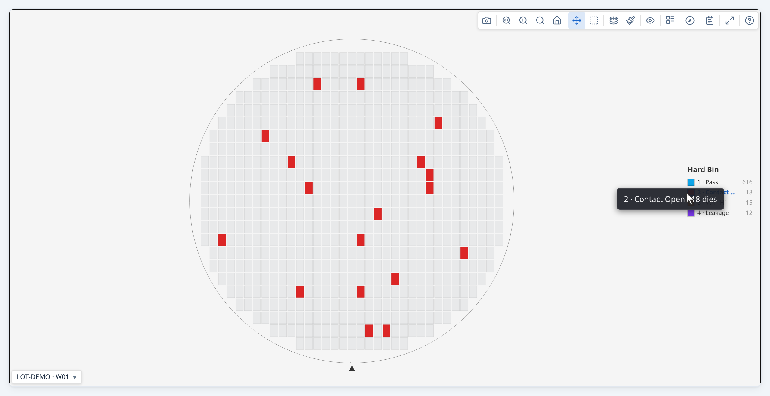
Developer Guide — Display and interaction
Part of the Developer Guide.
Controlling the display
Initial display options
Pass viewOptions to renderWaferMap to set the initial state:
renderWaferMap(container, result, {
  viewOptions: {
    plotMode:                'hardBin',
    binColorScheme:          'default',     // bin maps: 'default' | 'accessible' (colour-blind safe)
    valueColorScheme:        'default',     // value maps: 'default' (Viridis) | 'cividis' | 'plasma' | 'mako' | …
    reverseValueScheme:      false,         // flip the gradient end-for-end
    showRingBoundaries:      true,
    showQuadrantBoundaries:  false,
    showDieLabels:           false,         // die index labels
    showXYIndicator:         true,
    rotation:                0,             // 0, 90, 180, 270
    flipX:                   false,
    flipY:                   false,
    legendPosition:             'default',     // 'default'|'compact'|'left'|'top'|'bottom'|'floating'
  },
});
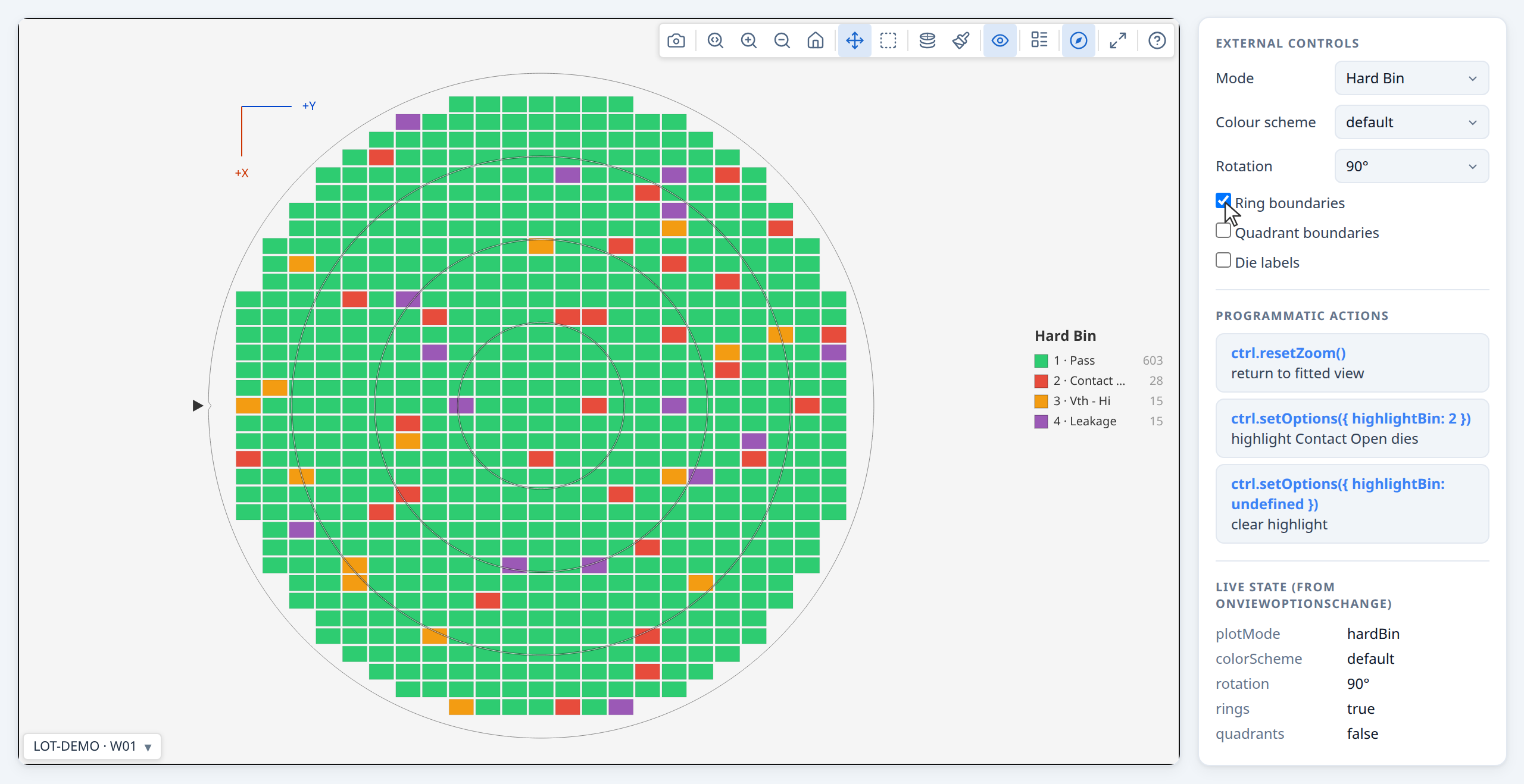
All of these can also be changed by the user via the toolbar at any time.
Programmatic control
renderWaferMap returns a controller you can call from application code:
const ctrl = renderWaferMap(container, result, { viewOptions: { plotMode: 'hardBin' } });

// Switch display mode (activeTest is a testNumber, e.g. from testDefs):
ctrl.setOptions({ plotMode: 'value', activeTest: 1050 });

// Replace the result (e.g. after a data reload) — preserves zoom/pan:
ctrl.setResult(newResult);

// Read current state:
const opts = ctrl.getOptions();
console.log(opts.plotMode, opts.binColorScheme, opts.valueColorScheme);

// Return to default zoom:
ctrl.resetZoom();

// Clean up when the component unmounts:
ctrl.destroy();
Syncing with external UI controls
Use onViewOptionsChange to keep your own UI elements in sync with the toolbar:
const ctrl = renderWaferMap(container, result, {
  viewOptions: { plotMode: 'hardBin' },
  onViewOptionsChange: (opts) => {
    modeDropdown.value     = opts.plotMode;
    schemeDropdown.value   = opts.valueColorScheme ?? 'default';
    ringsCheckbox.checked  = opts.showRingBoundaries ?? false;
  },
});

// When your own control changes, push it back:
modeDropdown.addEventListener('change', () => {
  ctrl.setOptions({ plotMode: modeDropdown.value });
});
onViewOptionsChangefires only when the toolbar changes options. Callingctrl.setOptions()programmatically does NOT re-fire it, so there is no feedback loop.
Hiding the toolbar
If you want a static display with no toolbar:
To keep your app's own mode controls in step with the toolbar, listen for changes:
renderWaferMap(container, result, {
  viewOptions: { plotMode: 'value' },
  onViewOptionsChange: (opts) => syncMyModeUI(opts),
});
Bin legend position
In hardBin and softBin modes, the bin legend can be placed in six positions via the Legend style toolbar button or the legendPosition option:
| Value | Behaviour |
|---|---|
'default' |
Vertical list on the right (full labels + counts). Auto-adapts: switches to compact below 280 px canvas width, floating below 180 px. |
'compact' |
Vertical list on the right (bin numbers only) |
'left' |
Vertical list on the left (full labels + counts) |
'top' |
Horizontal strip above the wafer (multi-column, auto-fitted) |
'bottom' |
Horizontal strip below the wafer (multi-column, auto-fitted) |
'floating' |
Draggable overlay, initially bottom-right (full labels + counts) |
Set the initial position via viewOptions — the user can change it at any time via the toolbar:
renderWaferMap(container, result, {
  viewOptions: { plotMode: 'hardBin', legendPosition: 'floating' },
});
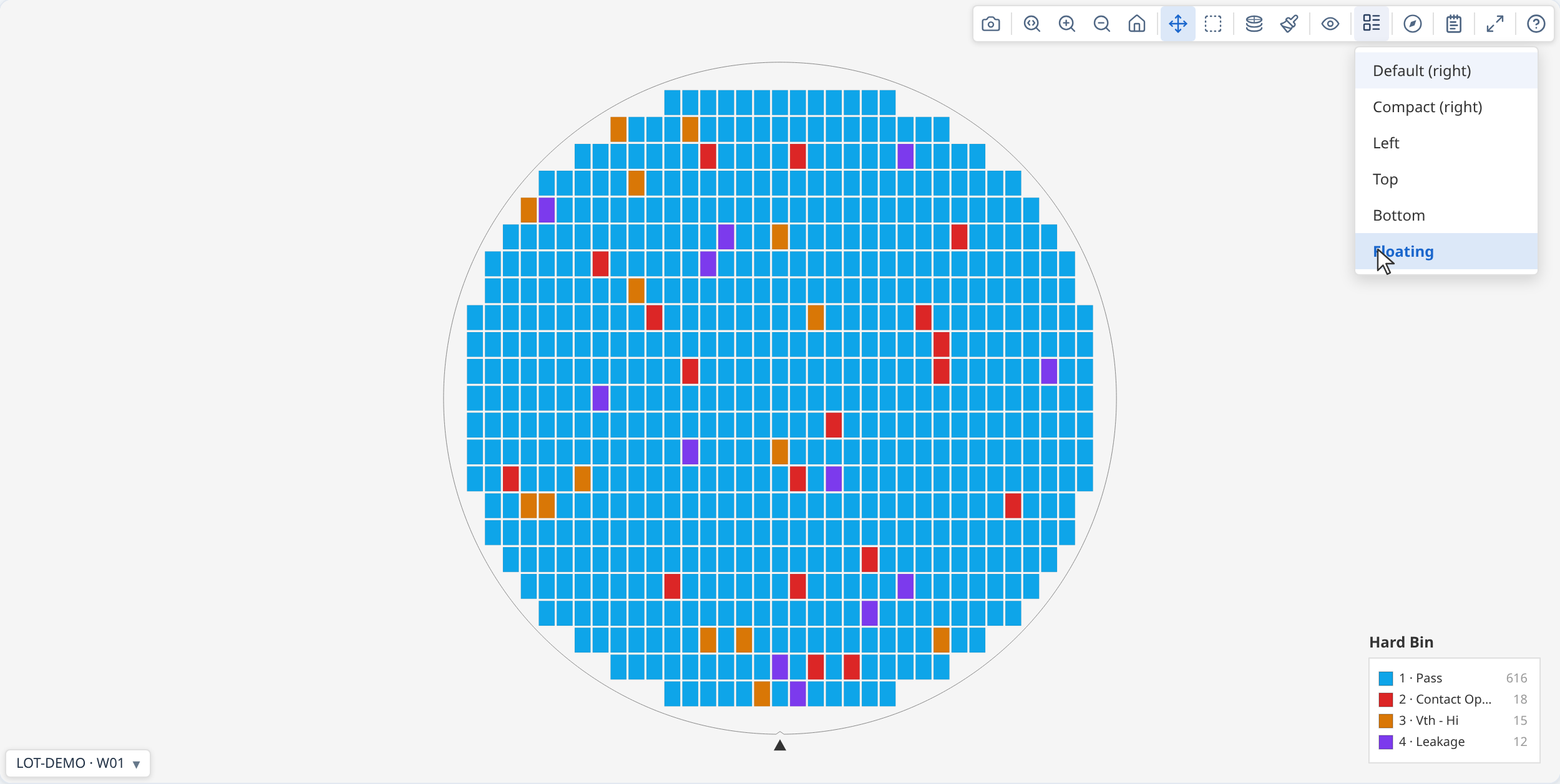
The Legend style button is automatically disabled when the map is in value or stacked mode, since those modes use a continuous colorbar instead of a bin legend.
For galleries, set it the same way; it applies to all cards:
Toolbar reference
The toolbar is always shown — at the top-right of a single map, or as a persistent bar above the gallery grid. Which buttons appear depends on the context and the current data.
Single map toolbar

| Button | Condition | What it does | |
|---|---|---|---|
 |
Download PNG | Always | Saves the current canvas at current zoom/rotation |
 |
Zoom mode | Always | Drag to zoom into a region |
   |
Zoom in / Zoom out / Reset | Always | Step zoom; Reset returns to fitted view |
 |
Pan mode | Always | Drag to pan |
 |
Box select | Always | Drag to select a group of dies; fires onSelect when provided |
 |
Plot mode | Always | Opens mode menu: Test Value, Hard Bin, Soft Bin, and Stacked modes (only when map was built with lotStack) |
 |
Colour palette | Always | Opens colour scheme picker |
 |
Log scale | Value / stacked-values mode only | Toggles log₁₀ colour normalisation; disabled when min ≤ 0; hidden whenever a solid pass/fail display is active or the active test is functional (log scale has no effect on pass/fail colouring) |
 |
Colorbar range | Value mode, test has limitLow or limitHigh, pass/fail display off |
Toggles the colorbar's numeric range between spec-limit range ([limitLow, limitHigh]) and data range (actual min/max). Out-of-spec dies are flagged with ▽/△ markers in both. |
 |
Overlays | Always | Dropdown: Ring boundaries, Quadrant lines, Die labels, Reticle grid (when reticles present), XY indicator, Limit pass/fail (value mode, test has limits), Test pass/fail (value mode, active test is functional or has recorded verdicts) |
 |
Legend style | Hard bin or soft bin mode only | Dropdown: legend position (default, compact, left, top, bottom, floating) |
 |
Orientation | Always | Dropdown: Rotate 90° CW, Flip horizontal, Flip vertical |
 |
Summary | Only when statsSummary is provided |
Toggles the Summary panel (metadata, yield, bins, ring/quadrant, test values, findings) |
 |
Insights | Unless insights: { enabled: false } |
Swaps the map for this wafer's own chart suite — see The Insights tab |
 |
Expand | Unless showExpandButton: false |
Opens the map in an enlarged modal overlay; canvas reparented — no view rebuild. A maximise button in the modal grows it to fill the window (F). E key shortcut (also disabled when showExpandButton: false). Hidden (and E disabled) while the Insights tab is open — see below. |
 |
User guide | Only when showHelpButton: true |
Opens the built-in end-user guide — a real, separate window when available, falling back to an in-page non-modal floating window when window.open is blocked (some embedded WebViews). Callable directly via openUserGuide() regardless of showHelpButton. userGuideExtension inserts a host app's own documentation into it, see API reference |
A gallery card's detached window shows the full toolbar. In the gallery, cards show only the navigation controls (download, zoom, pan, select) — the view controls (mode, overlays, orient, etc.) live in the shared gallery bar.
While the Insights tab is open, every button above except Insights and User guide is hidden — none of the others (download, zoom/pan/select, mode, palette, overlays, legend, orientation, Expand) apply to the chart suite underneath, and Findings specifically toggles the map's own findings panel, which sits behind the Insights tab's opaque overlay with no visible effect while it's open. Expand is hidden rather than repurposed: each chart panel inside Insights has its own expand button for enlarging that one chart instead.
Gallery control bar

The gallery control bar is always visible above the card grid.
| Button | Condition | What it does | |
|---|---|---|---|
|
Plot mode | Always | Same mode menu as single map; stacked modes always available in the gallery |
|
Colour palette | Always | Colour scheme picker; applies to all cards |
 |
Aggregation method | Stacked Test Values mode only | Selects mean, median, std dev, min, max, or count; re-aggregates all cards immediately |
|
Log scale | Value / stacked-values mode only | Applies to all cards |
|
Colorbar range | Value mode, active test has limitLow or limitHigh, pass/fail display off |
Toggles the colorbar's numeric range: spec-limit range ↔ data range. Out-of-spec dies are flagged with ▽/△ markers in both; applies to all cards |
|
Overlays | Always | Dropdown: Ring boundaries, Quadrant lines, Die labels, Reticle grid (when any card has reticles), XY indicator, Limit pass/fail (value mode, active test has limits), Test pass/fail (value mode, active test is functional or has recorded verdicts) — applies to all cards |
|
Legend style | Always | Dropdown: Legend on each map toggle (off by default — the lot legend strip stands in for it), then the per-card legend position, available only while that toggle is on and in a bin or metadata mode |
|
Orientation | Always | Dropdown: Rotate 90° CW, Flip horizontal, Flip vertical — applies to all cards |
 |
Columns | Always | Dropdown: fix the column count to 1–5, or choose Auto to let the gallery size columns based on die pitch. Cards are size-capped and pack from the left rather than stretching to fill the width |
 |
Download all | Always | Exports all cards as a single tiled PNG |
|
Summary panel | Only when lotStatsSummary is provided |
Toggles the summary and findings panel covering every wafer in the gallery |
|
Insights | Unless insights: { enabled: false } |
Swaps the grid for a chart suite covering every wafer — see The Insights tab |
|
User guide | Only when showHelpButton: true |
Opens the built-in end-user guide — a real, separate window when available, falling back to an in-page non-modal floating window when window.open is blocked (some embedded WebViews). Callable directly via openUserGuide() regardless of showHelpButton. userGuideExtension inserts a host app's own documentation into it, see API reference |
While the Insights tab is open, every button above except Insights and User guide is hidden — none of the others (mode, palette, overlays, columns, download, etc.) apply to the chart suite underneath, and Summary panel specifically toggles the panel inside the grid body, which is already hidden while the Insights tab is showing.
Theming the chrome
wmap's chrome — the toolbar, gallery cards, summary panel, menus, tooltip — and the wafer canvas (background, axis labels, grid) are themed through --wmap-* CSS custom properties. Set them on any ancestor of the render container and everything wmap draws follows. Every token has a light default, so you override only what differs; a host that sets nothing gets the default light appearance.
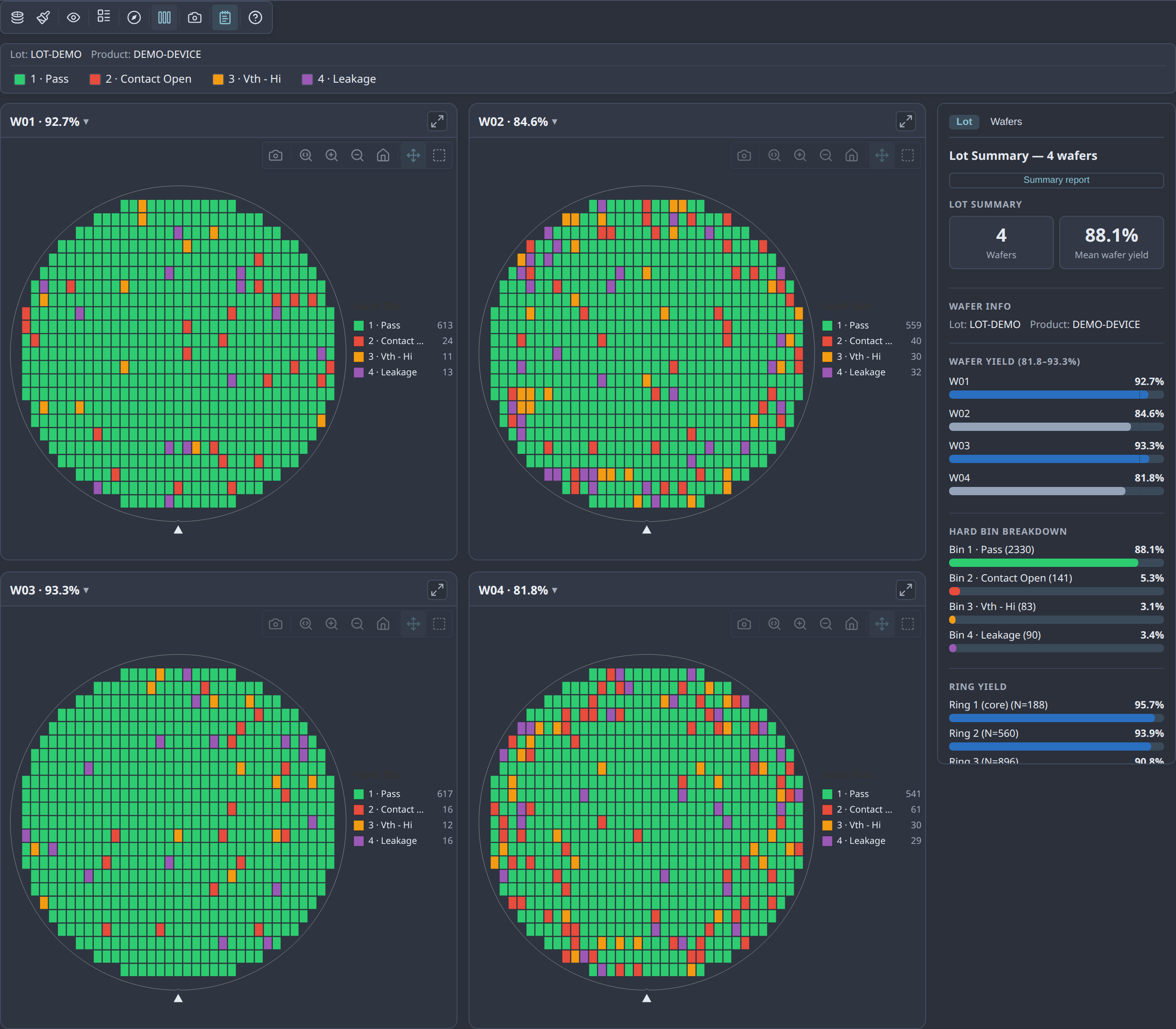
/* The Nord theme shown above — set on a wrapper around the render container */
.my-nord-wrap {
  --wmap-canvas-bg:   #2e3440;   /* the wafer canvas */
  --wmap-surface:     #323846;   /* cards, menus, toolbar */
  --wmap-panel-bg:    #2b303b;   /* summary panel */
  --wmap-border:      #434c5e;
  --wmap-text:        #e5e9f0;
  --wmap-text-muted:  #a6adbb;
  --wmap-icon:        #d8dee9;
  --wmap-icon-hover:  #88c0d0;   /* accent — hover/active affordances */
  --wmap-icon-active: #88c0d0;
  --wmap-selected:    #88c0d0;   /* finding-drilldown card outline */
  /* …see the full token table in the API reference… */
}
To follow the OS preference, put the light values on :root and override in a @media (prefers-color-scheme: dark) block. Canvas colours are re-resolved on a theme change or light/dark flip, so the wafer repaints to match.
The data palette (the bin/value colours of the dies) is separate — it's controlled by binColorScheme and valueColorScheme (see Custom colour schemes), not these tokens, and does not follow the chrome accent.
→ Demo: Theming with --wmap-* tokens · full token reference in the API docs
Custom colour schemes
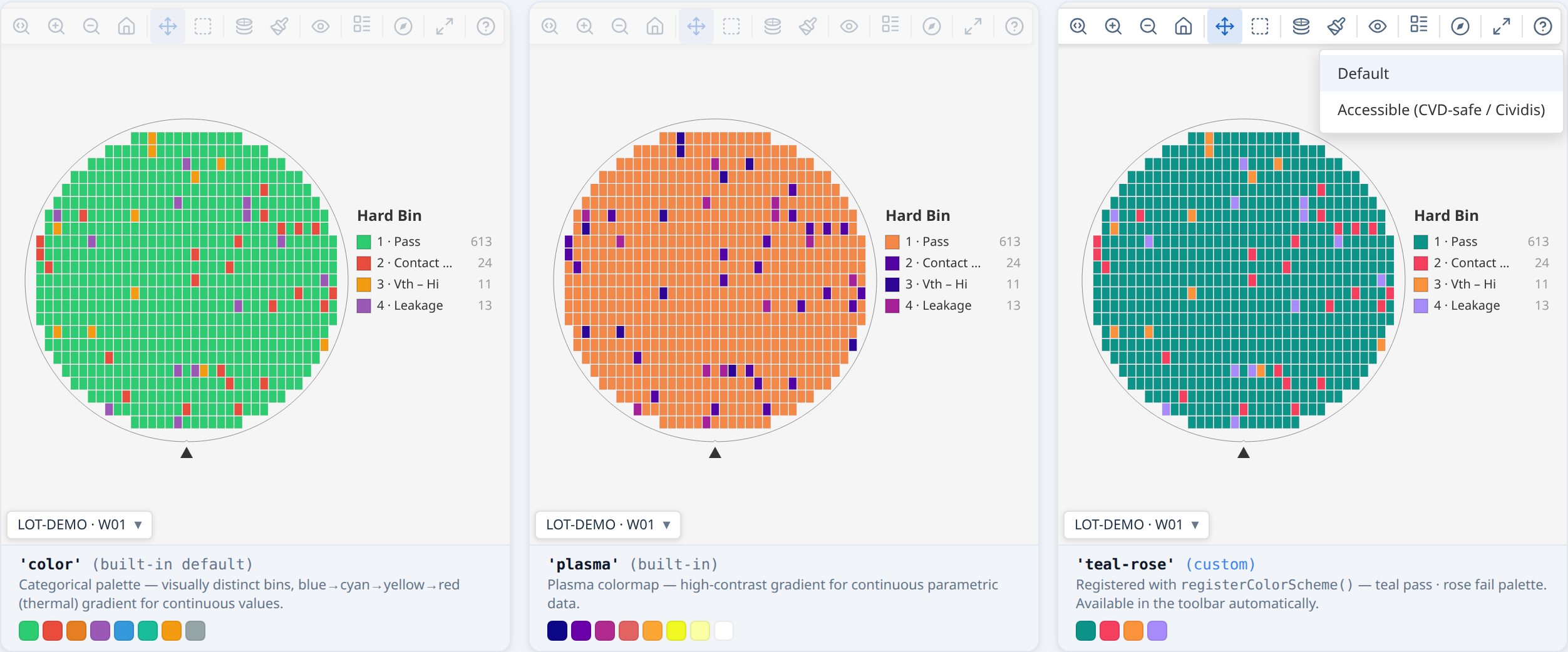
Bin maps and value maps have separate colour schemes, each its own view option and its own registry, so a user can keep Mako for values and the colour-blind-safe palette for bins without either resetting the other on a mode switch:
binColorScheme—'default'or'accessible'(colour-blind safe). Used by Hard Bin and Soft Bin maps.valueColorScheme—'default'(Viridis),'cividis'(colour-blind safe),'greyscale','plasma','inferno','mako','traffic'(green→yellow→red, low=good) and'jet'(the MATLAB rainbow). Used by Test Value maps and all three stacked modes — a stacked-bin map is a value map, showing how often a bin occurs at each position.reverseValueScheme— flips whichever gradient is selected, offered in the menu as Reverse gradient. One flag rather than a reversed twin of every ramp, so it works on a gradient you registered yourself too.
Every built-in but 'traffic' and 'jet' reads low = dark, high = light — the direction
matplotlib and seaborn define these ramps with. It is worth knowing why, because it is easy to
assume the opposite is friendlier: on a stacked map the healthy bulk of the wafer (fail count 0)
sits back as dark ground and an edge ring or a scratch lights up. Reversed, the defects become
dark specks on a glowing field, which is the harder read. Set reverseValueScheme when your
parameter genuinely has its notable end at the bottom.
Registering your own
import { registerBinColorScheme, registerValueColorScheme } from '@wafertools/wafermap';

registerBinColorScheme('my-brand', {
  label: 'My Brand',
  pass: ['#1b7f3b', '#7cc68a'],                         // passing bins, from bin 1
  fail: ['#c62828', '#1565c0', '#ef6c00', '#6a1b9a'],   // failing bins, from bin 2 — most distinct first, no greens
});

registerValueColorScheme('my-brand', {
  label: 'My Brand',
  forValue: (t: number) => `rgb(0,${Math.round(t * 100)},${Math.round(80 + t * 175)})`,  // t ∈ [0, 1]
});

// Each now appears in the matching toolbar Palette menu automatically. Apply programmatically:
ctrl.setOptions({ binColorScheme: 'my-brand', valueColorScheme: 'my-brand' });
Register your schemes once, before any renderWaferMap call.
They are global and persist for the lifetime of the page. Both choices are WaferPreferences,
so onViewOptionsChange reports a change to either with category 'preference' — save them
there and pass them back in viewOptions to remember a user's choice.
Responding to user interaction
Click and hover callbacks
renderWaferMap(container, result, {
  onClick: (die, event) => {
    console.log(`Clicked die (${die.x}, ${die.y})`);
    console.log('Hard bin:', die.hbin);
    console.log('Test values:', die.testValues);
    showDetailPanel(die);
  },
  onHover: (die, event) => {
    if (die) updateStatusBar(`(${die.x}, ${die.y})`);
    else     clearStatusBar();
  },
});
onClick and onHover receive the full Die object — die.x, die.y, die.testValues,
die.hbin, die.sbin, and any metadata you attached. onHover receives null when the cursor
leaves a die.
Box selection
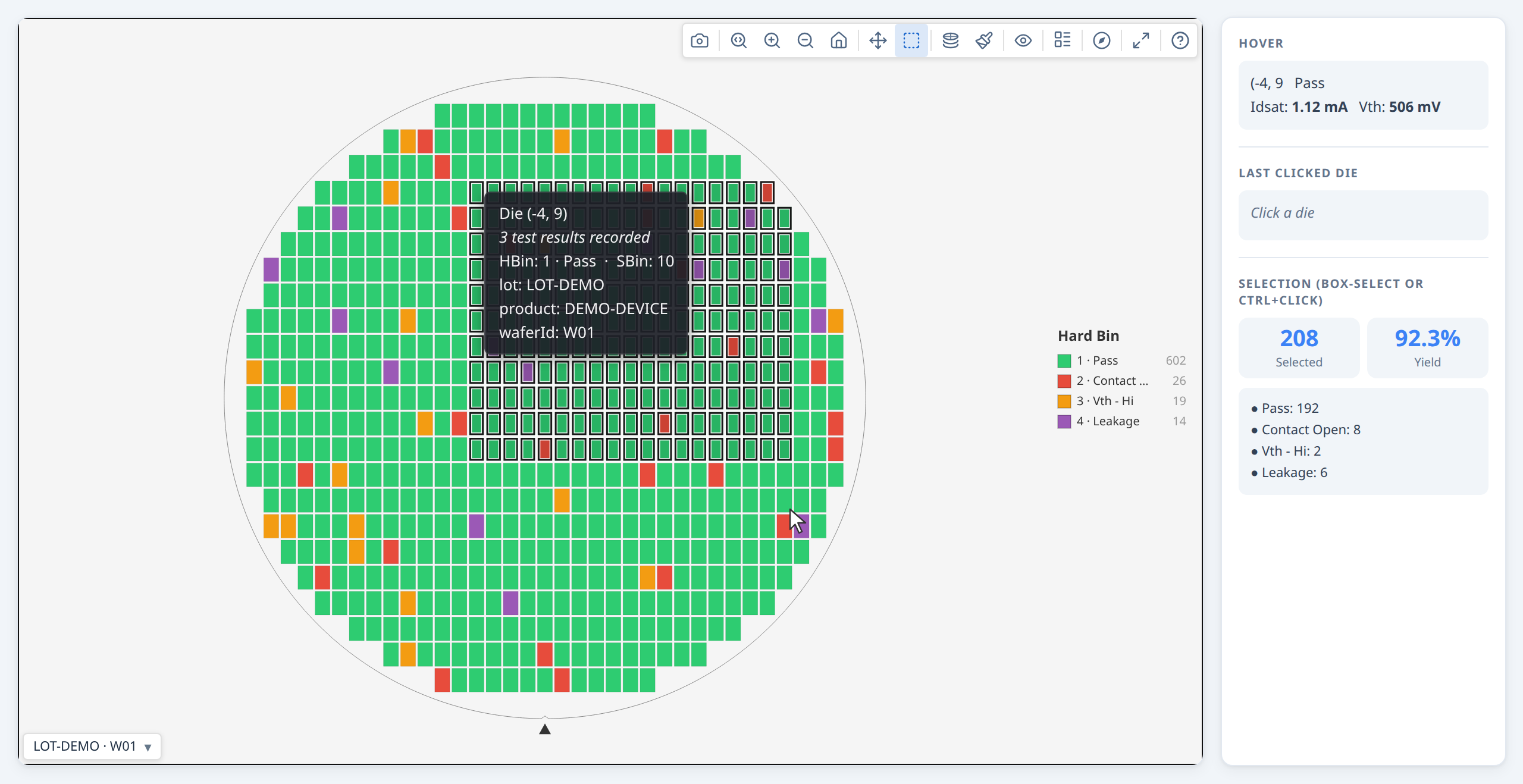
The box-select button is always in the toolbar. Provide onSelect to receive the selected dies when the user finishes a drag selection:
renderWaferMap(container, result, {
  onSelect: (selectedDies) => {
    console.log(`${selectedDies.length} dies selected`);
    const passing = selectedDies.filter(d => d.hbin === 1).length;
    showSelectionStats({ count: selectedDies.length, passing });
  },
});
Users can also click individual dies, Ctrl/Cmd+click to add to the selection, and press Esc to clear.
Programmatic selection
// Highlight a specific set of dies (e.g. from a table click):
const failingDies = result.dies.filter(d => d.hbin === 2);
ctrl.setSelection(failingDies);

// Clear:
ctrl.clearSelection();
Bin legend filter
In hardBin and softBin modes, clicking any row in the bin legend dims all dies that do not belong to that bin — making it easy to isolate a single failure category across the wafer. Click the same row again to clear the filter.
// Equivalent programmatic control:
ctrl.setOptions({ highlightBin: 2 });   // isolate bin 2
ctrl.setOptions({ highlightBin: undefined }); // clear
The filter also works in gallery view — clicking a legend row in the gallery toolbar highlights that bin across every card simultaneously.